We will develop android circular progress bar in this example tutorial.
In an android app, you need to show various types of progress bar to indicate some process.
Horizontal progress bar, circular progress bar, custom progress bar etc. are the types you can use.
Along with these, other types are determinate and indeterminate progress bars.
Determinate Progress bar
When you know the exact time ratio of the loading process, you should use determinate progress bar.
In the determinate progress bar you need to show to user that how much that process has done it’s operations.
Generally, developers use percentage as an indicator to tell user that how much percentage of the process has done it’s operation.
Indeterminate Progress bar
Indeterminate progress bar means that you do not know how much the process will take.
So this type of progress bar just shows some loading animations without any percentage.
We will develop four types of circular indeterminate progress bars in this example tutorial.
1. Android Circular Progress Bar With Percentage (Determinate)
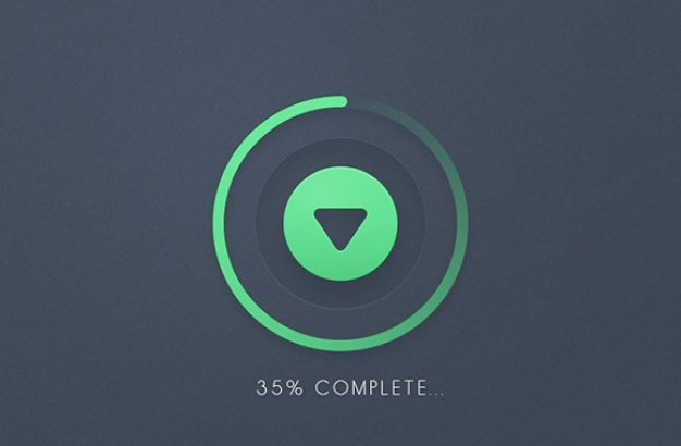
Today we are going to develop an android custom determinate circular progress bar.
We will also show how many percentages the process has finished. Amount of the percentage is displayed at the center of the circular progress bar.
Progress bar and percentage will increase with the time simultaneously. It does mean that we will create determinate circular progress bar today.
Take a look at the output first, and then we will show how to develop the android circular progress bar.
Creating Android Circular Progress Bar
Follow all the steps below.
Step 1. Create a new project in the Android Studio.
Make a new project in android studio first.
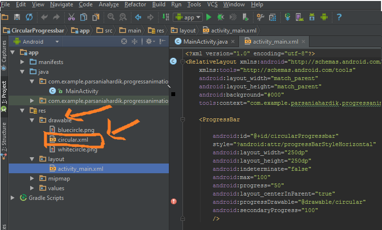
Step 2. Creating drawable resource file
Create one drawable resource file named circular.xml (drawable resource file means in android studio project’s file structure, you will find a folder named drawable inside a res folder as shown in the below image.)
Step 3. Coding circular.xml
Copy and paste following code into circular.xml
<?xml version="1.0" encoding="utf-8"?>
<layer-list xmlns:android="http://schemas.android.com/apk/res/android">
    <item android:id="@android:id/secondaryProgress">
        <shape
            android:innerRadiusRatio="6"
            android:shape="ring"
            android:thicknessRatio="20.0"
            android:useLevel="true">
            <gradient
                android:centerColor="#999999"
                android:endColor="#999999"
                android:startColor="#999999"
                android:type="sweep" />
        </shape>
    </item>
    <item android:id="@android:id/progress">
        <rotate
            android:fromDegrees="270"
            android:pivotX="50%"
            android:pivotY="50%"
            android:toDegrees="270">
            <shape
                android:innerRadiusRatio="6"
                android:shape="ring"
                android:thicknessRatio="20.0"
                android:useLevel="true">
                <rotate
                    android:fromDegrees="0"
                    android:pivotX="50%"
                    android:pivotY="50%"
                    android:toDegrees="360" />
                <gradient
                    android:centerColor="#00FF00"
                    android:endColor="#00FF00"
                    android:startColor="#00FF00"
                    android:type="sweep" />
            </shape>
        </rotate>
    </item>
</layer-list>
Consider the above code to generate circular progress bar. There is a grey colored circle which will be covered by the green circle as per below image.
The code which will generate grey circle (secondary progress) is as below
<item android:id="@android:id/secondaryProgress">
        <shape
            android:innerRadiusRatio="6"
            android:shape="ring"
            android:thicknessRatio="20.0"
            android:useLevel="true">
            <gradient
                android:centerColor="#999999"
                android:endColor="#999999"
                android:startColor="#999999"
                android:type="sweep" />
        </shape>
    </item>
android:shape = “ring”
Above line set the shape of the progress bar as circle or ring.
android:thicknessRatio=”20.0″
Above line will give thickness to our grey circle. You can change this value to make circle thicker or thinner.
In the <gradient> tag, center color, end color and startColor has same value so, the whole circle is grey.
You can play around by giving different values to all three variants.
Below code will generate the green circle (primary progress bar)
<item android:id="@android:id/progress">
        <rotate
            android:fromDegrees="270"
            android:pivotX="50%"
            android:pivotY="50%"
            android:toDegrees="270">
            <shape
                android:innerRadiusRatio="6"
                android:shape="ring"
                android:thicknessRatio="20.0"
                android:useLevel="true">
                <rotate
                    android:fromDegrees="0"
                    android:pivotX="50%"
                    android:pivotY="50%"
                    android:toDegrees="360" />
                <gradient
                    android:centerColor="#00FF00"
                    android:endColor="#00FF00"
                    android:startColor="#00FF00"
                    android:type="sweep" />
            </shape>
        </rotate>
    </item>
Properties of <shape> tag will define the primary progress.
It will give ring shape and thickness to the progress bar.
<gradient> tag will give green color in three different options (centerColor, endColor , startColor)
<rotate> tag will tell compiler to start the green progress bar from 0 value which is initial value. It means that process is starting from the scratch (start from 0%).
Step 4. Updating activity_main.xml
Copy and paste following in activity_main.xml
<?xml version="1.0" encoding="utf-8"?>
<RelativeLayout xmlns:android="http://schemas.android.com/apk/res/android"
    xmlns:tools="http://schemas.android.com/tools"
    android:layout_width="match_parent"
    android:layout_height="match_parent"
    android:background="#000"
    tools:context="com.example.parsaniahardik.progressanimation.MainActivity">
    <ProgressBar
        android:id="@+id/circularProgressbar"
        style="?android:attr/progressBarStyleHorizontal"
        android:layout_width="250dp"
        android:layout_height="250dp"
        android:indeterminate="false"
        android:max="100"
        android:progress="50"
        android:layout_centerInParent="true"
        android:progressDrawable="@drawable/circular"
        android:secondaryProgress="100"
        />
    <ImageView
        android:layout_width="100dp"
        android:layout_height="100dp"
        android:background="@drawable/whitecircle"
        android:layout_centerInParent="true"/>
    <TextView
        android:id="@+id/tv"
        android:layout_width="250dp"
        android:layout_height="250dp"
        android:gravity="center"
        android:text="25%"
        android:layout_centerInParent="true"
        android:textColor="@color/colorPrimaryDark"
        android:textSize="20sp" />
</RelativeLayout>
In above code, we have used a white circular image which you can download here. Put this image in the drawable folder.
TextView is representing how many percentage the process has finished.
Step 5. Describing Handler
We will use Handler and Thread to accomplish our goal.
new Thread(new Runnable() {
            @Override
            public void run() {
                // TODO Auto-generated method stub
                while (pStatus < 100) {
                    pStatus += 1;
                    handler.post(new Runnable() {
                        @Override
                        public void run() {
                            // TODO Auto-generated method stub
                            mProgress.setProgress(pStatus);
                            tv.setText(pStatus + "%");
                        }
                    });
                    try {
                        // Sleep for 200 milliseconds.
                        // Just to display the progress slowly
                        Thread.sleep(16); //thread will take approx 3 seconds to finish,change its value according to your needs
                    } catch (InterruptedException e) {
                        e.printStackTrace();
                    }
                }
            }
        }).start();
Above code will create a process for the specific amount of time, which can be decided by you.
You can change the time amount in the below method.
Thread.sleep(16);
Here 16 is the number you need to increase or decrease as per your requirements.
Step 6. Updating MainActivity.java class
Final code for MainActivity.java
import android.content.res.Resources;
import android.graphics.drawable.Drawable;
import android.os.Handler;
import android.support.v7.app.AppCompatActivity;
import android.os.Bundle;
import android.view.animation.DecelerateInterpolator;
import android.widget.ProgressBar;
import android.widget.TextView;
public class MainActivity extends AppCompatActivity {
    int pStatus = 0;
    private Handler handler = new Handler();
    TextView tv;
    @Override
    protected void onCreate(Bundle savedInstanceState) {
        super.onCreate(savedInstanceState);
        setContentView(R.layout.activity_main);
        Resources res = getResources();
        Drawable drawable = res.getDrawable(R.drawable.circular);
        final ProgressBar mProgress = (ProgressBar) findViewById(R.id.circularProgressbar);
        mProgress.setProgress(0);   // Main Progress
        mProgress.setSecondaryProgress(100); // Secondary Progress
        mProgress.setMax(100); // Maximum Progress
        mProgress.setProgressDrawable(drawable);
      /*  ObjectAnimator animation = ObjectAnimator.ofInt(mProgress, "progress", 0, 100);
        animation.setDuration(50000);
        animation.setInterpolator(new DecelerateInterpolator());
        animation.start();*/
        tv = (TextView) findViewById(R.id.tv);
        new Thread(new Runnable() {
            @Override
            public void run() {
                // TODO Auto-generated method stub
                while (pStatus < 100) {
                    pStatus += 1;
                    handler.post(new Runnable() {
                        @Override
                        public void run() {
                            // TODO Auto-generated method stub
                            mProgress.setProgress(pStatus);
                            tv.setText(pStatus + "%");
                        }
                    });
                    try {
                        // Sleep for 200 milliseconds.
                        // Just to display the progress slowly
                        Thread.sleep(16); //thread will take approx 3 seconds to finish
                    } catch (InterruptedException e) {
                        e.printStackTrace();
                    }
                }
            }
        }).start();
    }
}
Details Of the Above Code
Look at the below snippets
 Resources res = getResources();
        Drawable drawable = res.getDrawable(R.drawable.circular);
        final ProgressBar mProgress = (ProgressBar) findViewById(R.id.circularProgressbar);
Above code will declare the objects of Resource, Drawable and ProgressBar classes.
 mProgress.setProgress(0);   // Main Progress
        mProgress.setSecondaryProgress(100); // Secondary Progress
        mProgress.setMax(100); // Maximum Progress
        mProgress.setProgressDrawable(drawable);
In the above coding lines,
First line will set the progress as 0. It means that green progress bar will start from the 0 percentage.
Second line is setting the secondary progress bar (grey circle) as 100. It means that the whole circle will be created at the starting of the thread.
Third line will set the maximum of percentage. Generally, it is 100 in most of the cases because whenever we deal with percentage as a measuring parameter, the maximum number is always 100.
Fourth line will give layouts from drawable file (circular.xml) to both the progress bars. We have created this file in the Step 3 above.
After initialization process, we are starting the thread.
Thread will start our circular progress from 0 percentage to 100 percentage in around 3 seconds.
That’s all for android circular progress bar. Thank you for visiting and keep sharing resources of demonuts to other learners.
If you have any questions, then feel free to ask in the comment section.
Any suggestion about developing certain type of tutorial are also welcomed.
2. Android Indeterminate Circular Progress Bar (Without Percentage)
We will develop Android Indeterminate Circular Progress Bar in this post.
When you want to tell user that some process is going on and he need to wait till the end of that process, progress bar is the best way to do so.
Progress bar can be of two types regarding the progress status.
YouTube Output
Watch how does all four progress bars looks like
Step 1. Drawable files
For developing custom progress bars, we need to create some drawable xml files to define various properties.
Create a new xml file under res->drawable file and name it “first.xml“
Add below source code in first.xml
<?xml version="1.0" encoding="utf-8"?>
<rotate
    xmlns:android="http://schemas.android.com/apk/res/android"
    android:toDegrees="360">
    <shape android:shape="oval">
        <size
            android:height="48dp"
            android:width="48dp" />
        <gradient
            android:type="sweep"
            android:startColor="#00000000"
            android:centerColor="#e97575"
            android:endColor="#c70505" />
    </shape>
</rotate>
Now prepare another xml file named second.xml in the same directory.
Copy the following code in it
<?xml version="1.0" encoding="utf-8"?>
<layer-list xmlns:android="http://schemas.android.com/apk/res/android">
    <item android:id="@android:id/background">
        <shape
            android:shape="ring"
            android:innerRadius="30dp"
            android:thickness="20dp"
            android:useLevel="false">
            <solid android:color="#000000" />
        </shape>
    </item>
    <item android:id="@android:id/progress">
        <rotate android:toDegrees="360">
            <shape
                android:shape="ring"
                android:innerRadius="35dp"
                android:thickness="10dp"
                android:useLevel="false">
                <gradient
                    android:type="sweep"
                    android:startColor="#00000000"
                    android:endColor="#fffb03" />
            </shape>
        </rotate>
    </item>
</layer-list>
Create new xml file in the same directory named “third.xml” and write below lines
<?xml version="1.0" encoding="utf-8"?>
<layer-list xmlns:android="http://schemas.android.com/apk/res/android">
    <item android:id="@android:id/background">
        <shape
            android:shape="ring"
            android:innerRadius="30dp"
            android:thickness="20dp"
            android:useLevel="false">
            <gradient
                android:type="radial"
                android:gradientRadius="100"
                android:startColor="#FFF"
                android:endColor="#dc1b1b" />
            <stroke
                android:width="1dp"
                android:color="#AAA" />
        </shape>
    </item>
    <item android:id="@android:id/progress">
        <rotate android:toDegrees="360">
            <shape
                android:shape="ring"
                android:innerRadius="35dp"
                android:thickness="10dp">
                <gradient
                    android:type="radial"
                    android:gradientRadius="100"
                    android:startColor="#dcdc0b"
                    android:endColor="#00d4ff" />
            </shape>
        </rotate>
    </item>
</layer-list>
Let us understand properties from above three files.
android:shape=”oval”
In the <shape> tag, android:shape=”oval” will define the shape of the progress bar.
Value of shape can be ring, rectangle, line or oval.
android:thichness=”20dp”
This property defines the thickness of the circular progress bar.
android:startcolor & android:endcolor
These two properties are from the <gradient> tag.
First one defines the starting color and second one defines the end color of the gradient effect.
- There is also a third property called centerColor which defines middle color of the gradient effect.
Now make new xml file again in the same directory and name it “fourth.xml”
Enter below code in fourth.xml
<?xml version="1.0" encoding="utf-8"?>
<animated-rotate xmlns:android="http://schemas.android.com/apk/res/android"
    android:drawable="@drawable/image"
    android:pivotX="50%"
    android:pivotY="50%" />
In the fourth.xml file. there is reference to the image file.
Download this image by clicking the below link
[sociallocker]Download Red Progress bar Image[/sociallocker]
Above image will rotate constantly.
Image is developed in such way that when it rotates, it creates a shape like circular progress bar.
Step 2. Create All Four Activities
Prepare a new activity named “FirstActivity”.
You will have now two files activity_first.xml and FirstActivity.java
We do need to do anything with FirstActivity.java here.
Just add the following source code in activity_first.xml
<?xml version="1.0" encoding="utf-8"?>
<LinearLayout xmlns:android="http://schemas.android.com/apk/res/android"
    xmlns:app="http://schemas.android.com/apk/res-auto"
    xmlns:tools="http://schemas.android.com/tools"
    android:layout_width="match_parent"
    android:layout_height="match_parent"
    android:orientation="vertical"
    android:gravity="center"
    tools:context=".FirstActivity">
    <ProgressBar
        android:layout_width="100dp"
        android:layout_height="100dp"
        android:indeterminateDrawable="@drawable/first"
        android:indeterminateDuration="2000" />
</LinearLayout>
We setting the progress bar in the middle of the screen. In the LinearLayout, gravity=”center” is doing this task for us.
In the Progress bar, we have set the drawable as the first.xml file which have created in Step 1.
I have set the indeterminateDuration property as 2000. It is defining the speed of the circular progress bar.
If you want to increase the speed then increase this property. Decrease this property to slow down the progress bar.
Second Activity
Now create another activity called “Second Activity.”
Here you will have activity_second.xml and SecondActivity.java files.
Add below code in activity_second.xml
<?xml version="1.0" encoding="utf-8"?>
<LinearLayout xmlns:android="http://schemas.android.com/apk/res/android"
    xmlns:app="http://schemas.android.com/apk/res-auto"
    xmlns:tools="http://schemas.android.com/tools"
    android:layout_width="match_parent"
    android:layout_height="match_parent"
    android:orientation="vertical"
    android:gravity="center"
    tools:context=".SecondActivity">
    <ProgressBar
        android:layout_width="100dp"
        android:layout_height="100dp"
        android:indeterminateDrawable="@drawable/second"
        android:indeterminateDuration="1000" />
</LinearLayout>
Third Activity
Create new empty activity named third activity.
Add below code in activity_third.xml
<?xml version="1.0" encoding="utf-8"?>
<LinearLayout xmlns:android="http://schemas.android.com/apk/res/android"
    xmlns:app="http://schemas.android.com/apk/res-auto"
    xmlns:tools="http://schemas.android.com/tools"
    android:layout_width="match_parent"
    android:layout_height="match_parent"
    android:orientation="vertical"
    android:gravity="center"
    tools:context=".ThirdActivity">
    <ProgressBar
        android:layout_width="100dp"
        android:layout_height="100dp"
        android:indeterminateDrawable="@drawable/third"
        android:indeterminateDuration="1500" />
</LinearLayout>
Fourth Activity
Prepare another new activity and name it Fourth Activity.
Write down following code in activity_fourth.xml
<?xml version="1.0" encoding="utf-8"?>
<LinearLayout xmlns:android="http://schemas.android.com/apk/res/android"
    xmlns:app="http://schemas.android.com/apk/res-auto"
    xmlns:tools="http://schemas.android.com/tools"
    android:layout_width="match_parent"
    android:layout_height="match_parent"
    android:orientation="vertical"
    android:gravity="center"
    tools:context=".FourthActivity">
    <ProgressBar
        android:indeterminateDrawable="@drawable/fourth"
        android:layout_height="100dp"
        android:layout_width="100dp">
    </ProgressBar>
</LinearLayout>
Step 3. Towards End
Last thing is to add some code in activity_main.xml and MainActivity.java
Write down below source code in activity_main.xml
<?xml version="1.0" encoding="utf-8"?>
<LinearLayout
    xmlns:android="http://schemas.android.com/apk/res/android"
    xmlns:app="http://schemas.android.com/apk/res-auto"
    xmlns:tools="http://schemas.android.com/tools"
    android:layout_width="match_parent"
    android:layout_height="match_parent"
    android:gravity="center"
    android:orientation="vertical"
    tools:context=".MainActivity">
    <Button
        android:layout_width="wrap_content"
        android:layout_height="wrap_content"
        android:id="@+id/btn1"
        android:text="First Progress Bar"/>
    <Button
        android:layout_width="wrap_content"
        android:layout_height="wrap_content"
        android:id="@+id/btn2"
        android:text="Second Progress Bar"/>
    <Button
        android:layout_width="wrap_content"
        android:layout_height="wrap_content"
        android:id="@+id/btn3"
        android:text="Third Progress Bar"/>
    <Button
        android:layout_width="wrap_content"
        android:layout_height="wrap_content"
        android:id="@+id/btn4"
        android:text="Fourth Progress Bar"/>
</LinearLayout>
Code for MainActivity.java is as follows
import android.content.Intent;
import android.support.v7.app.AppCompatActivity;
import android.os.Bundle;
import android.view.View;
import android.widget.Button;
public class MainActivity extends AppCompatActivity {
    private Button btn1, btn2, btn3, btn4;
    @Override
    protected void onCreate(Bundle savedInstanceState) {
        super.onCreate(savedInstanceState);
        setContentView(R.layout.activity_main);
        btn1 = findViewById(R.id.btn1);
        btn2 = findViewById(R.id.btn2);
        btn3 = findViewById(R.id.btn3);
        btn4 = findViewById(R.id.btn4);
        btn1.setOnClickListener(new View.OnClickListener() {
            @Override
            public void onClick(View v) {
                Intent intent = new Intent(MainActivity.this,FirstActivity.class);
                startActivity(intent);
            }
        });
        btn2.setOnClickListener(new View.OnClickListener() {
            @Override
            public void onClick(View v) {
                Intent intent = new Intent(MainActivity.this,SecondActivity.class);
                startActivity(intent);
            }
        });
        btn3.setOnClickListener(new View.OnClickListener() {
            @Override
            public void onClick(View v) {
                Intent intent = new Intent(MainActivity.this,ThirdActivity.class);
                startActivity(intent);
            }
        });
        btn4.setOnClickListener(new View.OnClickListener() {
            @Override
            public void onClick(View v) {
                Intent intent = new Intent(MainActivity.this,FourthActivity.class);
                startActivity(intent);
            }
        });
    }
}
I have taken four buttons in this activity.
Each activity will be open on each button click.
3. Horizontal Progress Bar With Percentage In Android (Determinate)
Learn how to create Android Horizontal Progress Bar With Percentage Programmatically.
We will develop horizontal progress bar with percentage in this example tutorial.
There are many processes like downloading, uploading, fetching data from remote server etc. where you need to tell the user to wait for some time.
To accomplish this purpose, showing horizontal progress bar to the user is great option.
If you show the progress bar with percentage then the user will feel more comfortable while waiting.
View Output
This video demonstrate how our example’s output will look a like.
Determinate Horizontal Progress bar
Determinate progress bar means that you tell user that how much process is completed in terms of percentage.
When you know the exact or approximate time amount which will be taken by the process, you should use determinate progress bar.
You should use determinate progress bar when you do not have any idea about timing of the process.
We will create three horizontal progress bar with different designs in this tutorial.
Step 1. Drawable XML files
We need to create drawable xml files to develop various styles for progress bars.
Create a new xml file under res->drawable directory. Name it as progress_limit.xml
Add below source code in it
<?xml version="1.0" encoding="utf-8"?>
<layer-list xmlns:android="http://schemas.android.com/apk/res/android" >
    <item android:id="@android:id/background">
        <shape>
            <corners android:radius="5dip" />
            <gradient
                android:angle="270"
                android:centerColor="#ff5a5d5a"
                android:centerY="0.75"
                android:endColor="#ff747674"
                android:startColor="#ff9d9e9d" />
        </shape>
    </item>
     <item android:id="@android:id/secondaryProgress">
        <clip>
            <shape>
                <corners android:radius="5dip" />
                <gradient
                    android:angle="270"
                    android:centerColor="#80ffb600"
                    android:centerY="0.75"
                    android:endColor="#a0ffcb00"
                    android:startColor="#80ffd300" />
            </shape>
        </clip>
    </item>
    <item android:id="@android:id/progress">
        <clip>
            <shape>
                <corners android:radius="5dip" />
                <gradient
                    android:angle="270"
                    android:endColor="#008000"
                    android:startColor="#33FF33" />
            </shape>
        </clip>
    </item>
</layer-list>
Prepare another xml file under same directory.
Give name to that file as progress.xml
Write down following code in it
<?xml version="1.0" encoding="utf-8"?>
<layer-list xmlns:android="http://schemas.android.com/apk/res/android" >
    <item android:id="@android:id/background">
        <shape>
            <corners android:radius="5dip" />
            <gradient
                android:angle="270"
                android:centerColor="#ff5a5d5a"
                android:centerY="0.75"
                android:endColor="#ff747674"
                android:startColor="#ff9d9e9d" />
        </shape>
    </item>
    <item android:id="@android:id/secondaryProgress">
        <clip>
            <shape>
                <corners android:radius="5dip" />
                <gradient
                    android:angle="270"
                    android:centerColor="#80e664e1"
                    android:centerY="0.75"
                    android:endColor="#a0ff00e5"
                    android:startColor="#80ff00ff" />
            </shape>
        </clip>
    </item>
    <item android:id="@android:id/progress">
        <clip>
            <shape>
                <corners android:radius="5dip" />
                <gradient
                    android:angle="270"
                    android:endColor="#800000"
                    android:startColor="#ff3a33" />
            </shape>
        </clip>
    </item>
</layer-list>
Above two examples will create custom style for our progress bars.
It will create parameters like shape, color, gradient effect etc.
Step 2. Launching Progress bar
Now we need to change activity_main.xml and MainActivity.java files.
Write down the below source code in activity_main.xml file
<?xml version="1.0" encoding="utf-8"?>
<LinearLayout
    xmlns:android="http://schemas.android.com/apk/res/android"
    xmlns:app="http://schemas.android.com/apk/res-auto"
    xmlns:tools="http://schemas.android.com/tools"
    android:layout_width="match_parent"
    android:layout_height="match_parent"
    android:orientation="vertical"
    tools:context=".MainActivity">
    <TextView
        android:layout_width="wrap_content"
        android:layout_height="wrap_content"
        android:id="@+id/tv"
        android:layout_marginLeft="20dp"
        android:layout_marginTop="20dp"
        android:text="0/100"/>
    <ProgressBar
        android:id="@+id/pb"
        android:layout_width="250dp"
        android:layout_height="wrap_content"
        android:layout_marginLeft="10dp"
        android:layout_marginTop="10dp"
       style="@android:style/Widget.Holo.Light.ProgressBar.Horizontal" />
    <Button
        android:layout_width="wrap_content"
        android:layout_height="wrap_content"
        android:id="@+id/btn"
        android:text="start above progress bar"/>
    <TextView
        android:layout_width="wrap_content"
        android:layout_height="wrap_content"
        android:id="@+id/tv2"
        android:layout_marginLeft="20dp"
        android:layout_marginTop="20dp"
        android:text="0/100"/>
    <ProgressBar
        android:id="@+id/pb2"
        android:layout_marginTop="10dp"
        style="@style/Widget.AppCompat.ProgressBar.Horizontal"
        android:layout_width="match_parent"
        android:layout_height="wrap_content"
        android:indeterminate="false"
        android:max="100"
        android:maxHeight="10dip"
        android:minHeight="10dip"
        android:progress="0"
        android:secondaryProgress="100"
        android:progressDrawable="@drawable/progress_limit" />
    <Button
        android:layout_width="wrap_content"
        android:layout_height="wrap_content"
        android:id="@+id/btn2"
        android:text="start above progress bar"/>
    <TextView
        android:layout_width="wrap_content"
        android:layout_height="wrap_content"
        android:id="@+id/tv3"
        android:layout_marginLeft="20dp"
        android:layout_marginTop="20dp"
        android:text="0/100"/>
    <ProgressBar
        android:id="@+id/pb3"
        android:layout_marginTop="10dp"
        style="@style/Widget.AppCompat.ProgressBar.Horizontal"
        android:layout_width="match_parent"
        android:layout_height="wrap_content"
        android:indeterminate="false"
        android:max="100"
        android:maxHeight="10dip"
        android:minHeight="10dip"
        android:progress="0"
        android:secondaryProgress="100"
        android:progressDrawable="@drawable/progress_limit" />
    <Button
        android:layout_width="wrap_content"
        android:layout_height="wrap_content"
        android:id="@+id/btn3"
        android:text="start above progress bar"/>
</LinearLayout>
We are going to show three progress bars. So, I have taken three textviews, three buttons and three progress bars in this file.
All three textviews will show the completion percentage.
I have implemented button for each progress bar. When the user clicks on button, a progress bar related to that button will start it’s operations.
Now consider the below code
<ProgressBar
        android:id="@+id/pb"
        android:layout_width="250dp"
        android:layout_height="wrap_content"
        android:layout_marginLeft="10dp"
        android:layout_marginTop="10dp"
       style="@android:style/Widget.Holo.Light.ProgressBar.Horizontal" />
Above is our first progress bar.
I have used android’s in-built style for this progress bar. So we do not require to attach any drawable files in the above code.
Below is the code for second horizontal progress bar.
<ProgressBar
        android:id="@+id/pb2"
        android:layout_marginTop="10dp"
        style="@style/Widget.AppCompat.ProgressBar.Horizontal"
        android:layout_width="match_parent"
        android:layout_height="wrap_content"
        android:indeterminate="false"
        android:max="100"
        android:maxHeight="10dip"
        android:minHeight="10dip"
        android:progress="0"
        android:secondaryProgress="100"
        android:progressDrawable="@drawable/progress_limit" />
I have attached a drawable xml file progress_limit.xml to this progress bar.
This progress bar contains two types of progresses. Primary progress and Secondary Progress.
Both progresses will increase it’s value simultaneously with the loading of the process.
In this code, I have set the secondary progress as 100 means that it will have full value.
Following is the third progress bar source code.
<ProgressBar
    android:id="@+id/pb3"
    android:layout_marginTop="10dp"
    style="@style/Widget.AppCompat.ProgressBar.Horizontal"
    android:layout_width="match_parent"
    android:layout_height="wrap_content"
    android:indeterminate="false"
    android:max="100"
    android:maxHeight="10dip"
    android:minHeight="10dip"
    android:progress="0"
    android:progressDrawable="@drawable/progress" />
I have attached progress.xml file from drawable directory which we developed in Step 1.
We will show different colors in the progress bars with help of xml files of drawable directory.
Finally, write down the following coding lines in MainActivity.java
import android.os.Handler;
import android.support.v7.app.AppCompatActivity;
import android.os.Bundle;
import android.view.View;
import android.widget.Button;
import android.widget.ProgressBar;
import android.widget.TextView;
public class MainActivity extends AppCompatActivity {
    private TextView tv, tv2, tv3;
    private Button btn, btn2, btn3;
    private ProgressBar progressBar, progressBar2, progressBar3;
    private int progressStatus = 0, progressStatus2 = 0, progressStatus3 = 0;
    private Handler handler = new Handler();
    @Override
    protected void onCreate(Bundle savedInstanceState) {
        super.onCreate(savedInstanceState);
        setContentView(R.layout.activity_main);
        tv = findViewById(R.id.tv);
        btn = findViewById(R.id.btn);
        progressBar = findViewById(R.id.pb);
        tv2 = findViewById(R.id.tv2);
        btn2 = findViewById(R.id.btn2);
        progressBar2 = findViewById(R.id.pb2);
        tv3 = findViewById(R.id.tv3);
        btn3 = findViewById(R.id.btn3);
        progressBar3 = findViewById(R.id.pb3);
        btn.setOnClickListener(new View.OnClickListener() {
            @Override
            public void onClick(View v) {
                if (progressStatus == 100) {
                    progressStatus = 0;
                }
                new Thread(new Runnable() {
                    @Override
                    public void run() {
                        while (progressStatus < 100) {
                            // Update the progress status
                            progressStatus += 1;
                            // Try to sleep the thread for 20 milliseconds
                            try {
                                Thread.sleep(20);  //3 seconds
                            } catch (InterruptedException e) {
                                e.printStackTrace();
                            }
                            // Update the progress bar
                            handler.post(new Runnable() {
                                @Override
                                public void run() {
                                    progressBar.setProgress(progressStatus);
                                    // Show the progress on TextView
                                    tv.setText(progressStatus + "/100");
                                }
                            });
                        }
                    }
                }).start(); // Start the operation
            }
        });
        btn2.setOnClickListener(new View.OnClickListener() {
            @Override
            public void onClick(View v) {
                if (progressStatus2 == 100) {
                    progressStatus2 = 0;
                }
                new Thread(new Runnable() {
                    @Override
                    public void run() {
                        while (progressStatus2 < 100) {
                            // Update the progress status
                            progressStatus2 += 1;
                            // Try to sleep the thread for 20 milliseconds
                            try {
                                Thread.sleep(20);  //3 seconds
                            } catch (InterruptedException e) {
                                e.printStackTrace();
                            }
                            // Update the progress bar
                            handler.post(new Runnable() {
                                @Override
                                public void run() {
                                    progressBar2.setProgress(progressStatus2);
                                    // Show the progress on TextView
                                    tv2.setText(progressStatus2 + "/100");
                                }
                            });
                        }
                    }
                }).start(); // Start the operation
            }
        });
        btn3.setOnClickListener(new View.OnClickListener() {
            @Override
            public void onClick(View v) {
                if (progressStatus3 == 100) {
                    progressStatus3 = 0;
                }
                new Thread(new Runnable() {
                    @Override
                    public void run() {
                        while (progressStatus3 < 100) {
                            // Update the progress status
                            progressStatus3 += 1;
                            // Try to sleep the thread for 20 milliseconds
                            try {
                                Thread.sleep(20);  //3 seconds
                            } catch (InterruptedException e) {
                                e.printStackTrace();
                            }
                            // Update the progress bar
                            handler.post(new Runnable() {
                                @Override
                                public void run() {
                                    progressBar3.setProgress(progressStatus3);
                                    progressBar3.setSecondaryProgress(progressStatus3 + 15);
                                    // Show the progress on TextView
                                    tv3.setText(progressStatus3 + "/100");
                                }
                            });
                        }
                    }
                }).start(); // Start the operation
            }
        });
    }
}
Look at the below code
private int progressStatus = 0, progressStatus2 = 0, progressStatus3 = 0;
I have declared three integer variables. These variables will represent the amount or percentage of the completed process.
Following code will run the progress bar.
btn.setOnClickListener(new View.OnClickListener() {
            @Override
            public void onClick(View v) {
                if (progressStatus == 100) {
                    progressStatus = 0;
                }
                new Thread(new Runnable() {
                    @Override
                    public void run() {
                        while (progressStatus < 100) {
                            // Update the progress status
                            progressStatus += 1;
                            // Try to sleep the thread for 20 milliseconds
                            try {
                                Thread.sleep(20);  //3 seconds
                            } catch (InterruptedException e) {
                                e.printStackTrace();
                            }
                            // Update the progress bar
                            handler.post(new Runnable() {
                                @Override
                                public void run() {
                                    progressBar.setProgress(progressStatus);
                                    // Show the progress on TextView
                                    tv.setText(progressStatus + "/100");
                                }
                            });
                        }
                    }
                }).start(); // Start the operation
            }
        });
I have used handler class to start the thread. This thread will approximately take 3 seconds complete.
It means that our progress bar will start from 0 and will reach at 100 percentage in 3 seconds.
You change the time as per your requirements using the following line.
Thread.sleep(20); //3 seconds
Change the amount to other than 20 in the above code.
In the thread, compiler will check one while() loop.
if the value of the progressStatus variable is less than 100 then compiler will execute the code inside the while() loop, otherwise, it will terminate the thread.
When progressStatus is less than 100 then the compiler will increase the value of progressStatus by one unit.
After that, it will update the value of textview with latest value of progressStatus using below line.
progressBar.setProgress(progressStatus);
// Show the progress on TextView
 tv.setText(progressStatus + "/100");
Above code will also set the progressStatus to the progress bar.
4. Android Indeterminate Horizontal Progress Bar (Without Percentage)
We will Programmatically create Android Indeterminate Horizontal Progress Bar example tutorial today.
Generally, we use progress bar when we want to tell user that some process going on.
Here, user have to wait until the process is completed. The best way to handle this situation is to animate some progress symbol.
Now process also can be of two types. One which have specific time amount to complete it’s operation which is called determinate.
Other one is indeterminate where you do not have any clue about the total time required by the process.
In determinate process, you can show percentage to give user a little idea about how long he needs to wait.
While in the case of indeterminate you can not show any indicator like percentage.
So you need to create a specific indeterminate progress bar for scenario.
We will create horizontal indeterminate progress bar in this example.
This example includes four different types of indeterminate progress bars.
All Four Horizontal Progress Bars
Below is the visual representation of all four progress bars.
Follow all the below steps to complete this tutorial.
Step 1. Main Layout
First of all, create a new activity in the android studio. It is advisable to select “Empty Activity” while creating fresh project in the android studio.
We will define our xml code for progress bars in the activity_main.xml file.
Add the below code snippet in the activity_main.xml file.
<?xml version="1.0" encoding="utf-8"?>
<LinearLayout xmlns:android="http://schemas.android.com/apk/res/android"
    xmlns:app="http://schemas.android.com/apk/res-auto"
    xmlns:tools="http://schemas.android.com/tools"
    android:orientation="vertical"
    android:layout_width="match_parent"
    android:layout_height="match_parent"
    tools:context=".MainActivity">
    <ProgressBar
        android:id="@+id/progressBar1"
        android:layout_marginTop="20dp"
        style="@style/Widget.AppCompat.ProgressBar.Horizontal"
        android:indeterminateOnly="true"
        android:layout_width="match_parent"
        android:layout_height="wrap_content" />
    <ProgressBar
        android:id="@+id/progressBar2"
        style="@android:style/Widget.ProgressBar.Horizontal"
        android:indeterminateOnly="true"
        android:layout_marginTop="40dp"
        android:layout_width="match_parent"
        android:layout_height="wrap_content" />
    <ProgressBar
        android:id="@+id/progressBar"
        style="@android:style/Widget.Holo.ProgressBar.Horizontal"
        android:layout_marginTop="40dp"
        android:indeterminateOnly="true"
        android:layout_width="match_parent"
        android:layout_height="wrap_content" />
    <ProgressBar
        android:id="@+id/pb4"
        style="@android:style/Widget.Holo.ProgressBar.Horizontal"
        android:layout_marginTop="40dp"
        android:progressDrawable="@drawable/second"
        android:layout_width="match_parent"
        android:layout_height="wrap_content" />
</LinearLayout>
First three progress bars have android’s in built style for horizontal progress bar.
Below is the style for first progress bar.
style="@style/Widget.AppCompat.ProgressBar.Horizontal"
Below two styles are for second and third progress bars respectively.
style="@android:style/Widget.ProgressBar.Horizontal"
style="@android:style/Widget.Holo.ProgressBar.Horizontal"
Now consider the below coding lines for fourth progress bar.
<ProgressBar
        android:id="@+id/pb4"
        style="@android:style/Widget.Holo.ProgressBar.Horizontal"
        android:layout_marginTop="40dp"
        android:progressDrawable="@drawable/second"
        android:layout_width="match_parent"
        android:layout_height="wrap_content" />
Here, we will use custom drawable along with the in-built style.
Drawable file will give specific properties to make custom horizontal progress bar.
We have used second.xml drawable file in the fourth progress bar.
Let us create second.xml file.
Create a new drawable xml file under directory res->drawable. Name it as second.xml
Copy the following code in it.
<?xml version="1.0" encoding="utf-8"?>
<layer-list xmlns:android="http://schemas.android.com/apk/res/android" >
    <item android:id="@android:id/background">
        <shape>
            <corners android:radius="5dip" />
            <gradient
                android:angle="270"
                android:centerColor="#eaea7f"
                android:centerY="0.75"
                android:endColor="#e7e551"
                android:startColor="#dfcf21" />
        </shape>
    </item>
    <item android:id="@android:id/secondaryProgress">
        <clip>
            <shape>
                <corners android:radius="5dip" />
                <gradient
                    android:angle="270"
                    android:centerColor="#80e664e1"
                    android:centerY="0.75"
                    android:endColor="#a0ff00e5"
                    android:startColor="#80ff00ff" />
            </shape>
        </clip>
    </item>
    <item android:id="@android:id/progress">
        <clip>
            <shape>
                <corners android:radius="5dip" />
                <gradient
                    android:angle="270"
                    android:centerColor="#8064e694"
                    android:centerY="0.75"
                    android:endColor="#a000ff2a"
                    android:startColor="#8033ff00" />
            </shape>
        </clip>
    </item>
</layer-list>
Step 2. Main Code
After working on XML files, it is time to play with java file.
Copy the following code snippet in MainActivity.java file.
import android.os.Handler;
import android.support.v7.app.AppCompatActivity;
import android.os.Bundle;
import android.widget.ProgressBar;
public class MainActivity extends AppCompatActivity {
    private ProgressBar progressBar4;
    private int pStatus = 0;
    private Handler handler;
    @Override
    protected void onCreate(Bundle savedInstanceState) {
        super.onCreate(savedInstanceState);
        setContentView(R.layout.activity_main);
        progressBar4 = findViewById(R.id.pb4);
        handler = new Handler();
        new Thread(new Runnable() {
            @Override
            public void run() {
                // TODO Auto-generated method stub
                while (pStatus < 100) {
                    pStatus++;
                    if(pStatus == 99){
                        pStatus = 0;
                    }
                    handler.post(new Runnable() {
                        @Override
                        public void run() {
                            // TODO Auto-generated method stub
                            progressBar4.setProgress(pStatus);
                            progressBar4.setSecondaryProgress(pStatus+15);
                        }
                    });
                    try {
                        // Sleep for 200 milliseconds.
                        // Just to display the progress slowly
                        Thread.sleep(16); //thread will take approx 3 seconds to finish
                    } catch (InterruptedException e) {
                        e.printStackTrace();
                    }
                }
            }
        }).start();
    }
}
Because we are using just android’s in-built style in the first three progress bars, we do not need to add any coding lines in java file for these progress bars.
We have handled some scenarios for the fourth one.
Consider the below code
private ProgressBar progressBar4;
 private int pStatus = 0;
 private Handler handler;
First line is declaring the object of the ProgressBar class.
Second one is creating the integer variable “pStatus” with zero as the initial value.
Third line is giving us Handler’s object.
Let us understand the below code structure for fourth progress bar.
handler = new Handler();
        new Thread(new Runnable() {
            @Override
            public void run() {
                // TODO Auto-generated method stub
                while (pStatus < 100) {
                    pStatus++;
                    if(pStatus == 99){
                        pStatus = 0;
                    }
                    handler.post(new Runnable() {
                        @Override
                        public void run() {
                            // TODO Auto-generated method stub
                            progressBar4.setProgress(pStatus);
                            progressBar4.setSecondaryProgress(pStatus+15);
                        }
                    });
                    try {
                        // Sleep for 200 milliseconds.
                        // Just to display the progress slowly
                        Thread.sleep(16); //thread will take approx 3 seconds to finish
                    } catch (InterruptedException e) {
                        e.printStackTrace();
                    }
                }
            }
        }).start();
First, we will initialize handler object to avoid null pointer exception
Then we will create a new thread to start the horizontal progress bar.
Compiler will check for while() method in the run() method of the thread.
In while() loop, compiler will check if the value of the integer variable pStatus is less than 100 or not.
If pstatus has less value than 100 then compiler will enter in the while loop. After entering, it will increase the value of pStatus by one.
Now it will again check one if condition. If the value of pStatus is 99 than it will set the value of pStatus as zero.
This if condition is responsible for the infinite running of the thread hence the infinite running of the horizontal progress bar.
After this, compiler will set the value of the primary progress and the secondary progress.