
You will look in Android Custom Spinner Tutorial With multiple Examples today.
Table Of Content
1. Android Spinner Custom Adapter Example Tutorial
2. Android Spinner Disable Item Dropdown Selected Item | Close Dropdown
3. Android Spinner Text Color Size Programmatically Selected Item & Dropdown
4. Android Spinner Divider Color Style Size Programmatically
5. Android Custom Spinner Dropdown Arrow Background Border Icon Color
6. Android Custom Spinner With Image And Text | Custom Adapter
1. Android Spinner Custom Adapter Example Tutorial
Learn to make android custom adapter for spinner in this tutorial with example.
Spinner is the basic and in-built UI widget of the android system. It is used to show some options among which user has to select only one.
Generally, spinner contains only option names in terms of text format. We use arrayadapter in most of the cases to populate the spinner.
With arrayadapter you can set only text items in the dropdown menu.
But what if you want to have different color or size for each dropdown? What if you want to change the background color of dropdown item?
Here, arrayadapter can not help us. We have to create our own custom adapter and need to make separate XML layout files for user interface of dropdown.
So follow all the steps to learn about custom adapter of android spinner.
Looks of Android Custom Spinner Custom Adapter
Step 1. Layout Files
In this case, we need to prepare couple of XML layout files.
These two files will help us to create custom layout and view structure for dropdown items as well as for main layout of spinner.
Make new XML file in res->layout directory. Give it a name as company_main.xml
Write the below code in company_main.xml
<LinearLayout xmlns:android="http://schemas.android.com/apk/res/android"
    android:layout_width="fill_parent"
    android:layout_height="wrap_content"
    android:orientation="vertical">

    <TextView
        android:layout_width="match_parent"
        android:layout_height="80dp"
        android:id="@+id/main"
        android:singleLine="true"
        android:layout_marginLeft="50dp"
        android:text="At res"
        android:textColor="#000"
        android:textSize="20sp"
        android:gravity="center_vertical" />

</LinearLayout>
This file will create a view for main layout of spinner.
I have taken only one textview in this file. You can also add other UI widgets like Image.
You can also change the color and size of the text from above code.
Now make another XML file under same directory. This time set the name as company_dropdown.xml
Coding lines for company_dropdown.xml are as following
<LinearLayout xmlns:android="http://schemas.android.com/apk/res/android"
    android:layout_width="fill_parent"
    android:layout_height="wrap_content"
    android:orientation="vertical">

    <TextView
        xmlns:android="http://schemas.android.com/apk/res/android"
        android:id="@+id/dropdown"
        android:layout_width="match_parent"
        android:gravity="center_vertical"
        android:layout_height="50dp"
        android:paddingLeft="10dp"
        android:textColor="#f20a0a"
        android:textSize="15sp" />

    <View
        android:layout_width="match_parent"
        android:layout_height="5dp"
        android:background="#ad10af"/>

</LinearLayout>
This file contains one textview and one simple view.
Textview will represent the dropdown texts. You can change size, color, style of dropdown texts using this textview.
You change the Background of dropdown row by changing background of this textview itself.
After textview, there is one simple view with some color as it’s background.
This view draws a divider between two rows of dropdown.
Step 2. Preparing Custom Adapter
Now it is time to make a custom adapter.
Create a new JAVA class named CustomAdapter.java
Write down the following lines in CustomAdapter.java
import android.content.Context;
import android.graphics.Color;
import android.util.Log;
import android.view.View;
import android.view.ViewGroup;
import android.widget.BaseAdapter;
import android.widget.Spinner;
import android.widget.SpinnerAdapter;
import android.widget.TextView;

public class CustomAdapter  extends BaseAdapter implements SpinnerAdapter {

    String[] company;
    Context context;
    String[] colors = {"#13edea","#e20ecd","#15ea0d"};
    String[] colorsback = {"#FF000000","#FFF5F1EC","#ea950d"};

    public CustomAdapter(Context context, String[] company) {
        this.company = company;
        this.context = context;
    }

    @Override
    public int getCount() {
        return company.length;
    }

    @Override
    public Object getItem(int position) {
        return company[position];
    }

    @Override
    public long getItemId(int position) {
        return position;
    }

    @Override
    public View getView(int position, View convertView, ViewGroup parent) {
        View view =  View.inflate(context, R.layout.company_main, null);
        TextView textView = (TextView) view.findViewById(R.id.main);
        textView.setText(company[position]);
        return textView;
    }

    @Override
    public View getDropDownView(int position, View convertView, ViewGroup parent) {

        View view;
        view =  View.inflate(context, R.layout.company_dropdown, null);
        final TextView textView = (TextView) view.findViewById(R.id.dropdown);
        textView.setText(company[position]);

        textView.setTextColor(Color.parseColor(colors[position]));
        textView.setBackgroundColor(Color.parseColor(colorsback[position]));


        return view;
    }
}
Going Deep
Checkout the below code
    String[] company;
    Context context;
    String[] colors = {"#13edea","#e20ecd","#15ea0d"};
    String[] colorsback = {"#FF000000","#FFF5F1EC","#ea950d"};
It is making objects of some string array variables and context.
colors and colorsback contains the text which represents the various colors.
We will use both of these string variables later in this class only.
Read the following getView() method
  @Override
    public View getView(int position, View convertView, ViewGroup parent) {
        View view =  View.inflate(context, R.layout.company_main, null);
        TextView textView = (TextView) view.findViewById(R.id.main);
        textView.setText(company[position]);
        return textView;
    }
This method is creating the view for the main spinner layout.
Compiler will first inflate the company_main.xml file.
Than you can customize the textview of this file as per your requirements.
Attend the getDropDownView() method.
 @Override
    public View getDropDownView(int position, View convertView, ViewGroup parent) {

        View view;
        view =  View.inflate(context, R.layout.company_dropdown, null);
        final TextView textView = (TextView) view.findViewById(R.id.dropdown);
        textView.setText(company[position]);

        textView.setTextColor(Color.parseColor(colors[position]));
        textView.setBackgroundColor(Color.parseColor(colorsback[position]));

        return view;
    }
This method will create the view for dropdown items.
It will inflate the company_dropdown.xml file.
Compiler will set text color and background color for every row.
Here we are using those colors and colorsback named string arrays.
Step 3. Final Changes
At last, we need to add some code in main files.
Copy down the following source code in activity_main.xml file.
<?xml version="1.0" encoding="utf-8"?>
<LinearLayout xmlns:android="http://schemas.android.com/apk/res/android"
    xmlns:app="http://schemas.android.com/apk/res-auto"
    xmlns:tools="http://schemas.android.com/tools"
    android:layout_width="match_parent"
    android:layout_height="match_parent"
    tools:context=".MainActivity">

    <Spinner
        android:id="@+id/spCompany"
        android:layout_width="match_parent"
        android:layout_height="45dp"
        android:layout_marginLeft="5dp"
        android:layout_marginRight="5dp"
        android:layout_marginTop="10dp"
        android:spinnerMode="dropdown"/>

</LinearLayout>
- I have taken one spinner in this layout.
- You do not need to change anything in this file. You should do all the changes in adapter class only to customize the things like color, size etc.
Now add the following code structure in MainActivity.java
import android.support.v7.app.AppCompatActivity;
import android.os.Bundle;
import android.widget.Spinner;

public class MainActivity extends AppCompatActivity {

    private String[] company = {"Apple","Samsung","Nokia"};
    public static Spinner spCompany;

    @Override
    protected void onCreate(Bundle savedInstanceState) {
        super.onCreate(savedInstanceState);
        setContentView(R.layout.activity_main);

        spCompany = findViewById(R.id.spCompany);
        CustomAdapter adapter = new CustomAdapter(this, company);
        spCompany.setAdapter(adapter);
    }
}
First of all, compiler will create one string array called “company.”
This string array contains the names of the companies.
Then compiler will create the object of the CustomAdapter class.
At last, just set this object to the spinner and your spinner with custom adapter is ready to take off.
2. Android Spinner Disable Item Dropdown Selecetd Item | Close Dropdown
You are reading Android Custom Spinner Disable Item Dropdown example tutorial.
Learn to hide/close android spinner dropdown programmatically in this example.
Disable an item which is currently selected, from the dropdown menu or pop up.
Generally, we use spinner to allow user to select any one item among multiple options.
Sometimes, developer wants to disable the current selected item in the dropdown menu. In this scenario user will not be able to click on that item from dropdown.
There are some occasions when there is only one option in the spinner. Here, we do not need to show dropdown.
You will learn how to handle all these tricky things about spinner in today’s tutorial.
View Disable Item
Step 1. Closing or Hiding Dropdown Menu Programmatically
You need to close or hide the whole dropdown menu when you have only one item in your spinner.
Let us achieve this goal. First, create a new project in android studio.
Add the below source code in activity_main.xml file
<?xml version="1.0" encoding="utf-8"?>
<LinearLayout xmlns:android="http://schemas.android.com/apk/res/android"
    xmlns:app="http://schemas.android.com/apk/res-auto"
    xmlns:tools="http://schemas.android.com/tools"
    android:layout_width="match_parent"
    android:layout_height="match_parent"
    android:orientation="vertical"
    tools:context=".MainActivity">

    <Button
        android:layout_width="match_parent"
        android:layout_height="wrap_content"
        android:text="Below spinner have only one value, so disable it's dropdown"/>

    <Spinner
        android:id="@+id/spinner"
        android:layout_width="match_parent"
        android:layout_height="45dp"
        android:layout_marginLeft="5dp"
        android:layout_marginRight="5dp"
        android:layout_marginTop="10dp"
        android:spinnerMode="dropdown"/>

 </LinearLayout>
- I have taken one button and one spinner in above layout file.
- Button is just saying that below spinner have single value so it has no dropdown menu.
Now write the following code in MainActivity.java file
import android.support.v7.app.AppCompatActivity;
import android.os.Bundle;
import android.view.MotionEvent;
import android.view.View;
import android.widget.AdapterView;
import android.widget.ArrayAdapter;
import android.widget.Spinner;

public class MainActivity extends AppCompatActivity {

    private String[] heaven = {"Heaven"};
    private Spinner spHeaven;

 @Override
    protected void onCreate(Bundle savedInstanceState) {
        super.onCreate(savedInstanceState);
        setContentView(R.layout.activity_main);

        spHeaven = findViewById(R.id.spinner);
        // Initializing an ArrayAdapter
        ArrayAdapter<String> spinnerArrayAdapter = new ArrayAdapter<String>(this,R.layout.support_simple_spinner_dropdown_item,heaven);
        spHeaven.setAdapter(spinnerArrayAdapter);

        spHeaven.setOnTouchListener(new View.OnTouchListener() {
            @Override
            public boolean onTouch(View v, MotionEvent event) {
                return true;
            }
        });
  }
}
First of all, compiler will create one string array variable named “heaven”.
This variable have only one item.
Then an object of spinner is defined.
In onCreate() method, we will find the spinner from layout file using it’s unique ID.
After this, compiler will create the array adapter using string array variable. (heaven).
And then it will set the adapter to our spinner.
Now read the following code block.
  spHeaven.setOnTouchListener(new View.OnTouchListener() {
            @Override
            public boolean onTouch(View v, MotionEvent event) {
                return true;
            }
        });
Compiler will execute above code when the user touches the spinner.
I do not have set any code for this method. It simply means that we are telling the compiler to do nothing when the user touches the spinner.
Generally, when the user touches the spinner, system will open the dropdown. But in this case, we are overriding this general approach via above code structure.
So we have handle the scenario with only one item in the spinner.
Now let us disable the selected item in dropdown.
Step 2. Disable particular Item in Dropdown
First of all, add the below code in activity_main.xml file
 <Button
        android:layout_width="match_parent"
        android:layout_height="wrap_content"
        android:text="Selected Value is disable in dropdown of Below spinner"/>

    <Spinner
        android:id="@+id/spColors"
        android:layout_width="match_parent"
        android:layout_height="45dp"
        android:layout_marginLeft="5dp"
        android:layout_marginRight="5dp"
        android:layout_marginTop="10dp"
        android:spinnerMode="dropdown"/>
Same as we have added earlier. One button and one spinner.
Button is telling that selected item will be disabled in dropdown of the below spinner.
To handle the complex scenario of disabling a particular item in dropdown, we need to create custom adapter.
Drawable files
- Before adapter first create a XML file under res->drawable directory.
- Name of this file should be color_main.xml
Add the below code structure in color_main.xml file
<LinearLayout xmlns:android="http://schemas.android.com/apk/res/android"
    android:layout_width="fill_parent"
    android:layout_height="wrap_content"
    android:orientation="vertical">

    <TextView
        android:layout_width="match_parent"
        android:layout_height="80dp"
        android:id="@+id/main"
        android:singleLine="true"
        android:layout_marginLeft="50dp"
        android:text="At res"
        android:textColor="#000"
        android:textSize="20sp"
        android:gravity="center_vertical" />

</LinearLayout>
- Above will create the view for main layout of the spinner.
- To change the background color of spinner or text color and size of spinner, you can change these properties in the above textview.
- Make another XML file in res->drawable directory.
- Give it a name as color_dropdown.xml
Code block for color_dropdown.xml is as the following
<LinearLayout xmlns:android="http://schemas.android.com/apk/res/android"
    android:layout_width="fill_parent"
    android:layout_height="wrap_content"
    android:orientation="vertical">

    <TextView
        xmlns:android="http://schemas.android.com/apk/res/android"
        android:id="@+id/dropdown"
        android:layout_width="match_parent"
        android:gravity="center_vertical"
        android:layout_height="50dp"
        android:paddingLeft="10dp"
        android:textColor="#f20a0a"
        android:textSize="15sp" />

    <View
        android:layout_width="match_parent"
        android:layout_height="5dp"
        android:background="#ad10af"/>

</LinearLayout>
This code will generate user interface for dropdown menu.
Every item of dropdown will inflate their text color and size from the above textview.
We can change text color and size for every spinner item via adapter class.
So let us prepare an adapter class.
Adapter Class
Create a new JAVA class named “ColorAdapter.java”
Write the following lines in “ColorAdapter.java” file
import android.content.Context;
import android.graphics.Color;
import android.view.View;
import android.view.ViewGroup;
import android.widget.BaseAdapter;
import android.widget.Spinner;
import android.widget.SpinnerAdapter;
import android.widget.TextView;
import java.lang.reflect.Method;

public class ColorAdapter extends BaseAdapter implements SpinnerAdapter {
    String[] brands;
    Context context;

    public ColorAdapter(Context context, String[] brands) {
        this.brands = brands;
        this.context = context;
    }

    public static void hideSpinnerDropDown(Spinner spinner) {
        try {
            Method method = Spinner.class.getDeclaredMethod("onDetachedFromWindow");
            method.setAccessible(true);
            method.invoke(spinner);
        } catch (Exception e) {
            e.printStackTrace();
        }
    }

    @Override
    public int getCount() {
        return brands.length;
    }

    @Override
    public Object getItem(int position) {
        return brands[position];
    }

    @Override
    public long getItemId(int position) {
        return position;
    }

    @Override
    public View getView(int position, View convertView, ViewGroup parent) {
        View view =  View.inflate(context, R.layout.color_main, null);
        TextView textView = (TextView) view.findViewById(R.id.main);
        textView.setText(brands[position]);
        return textView;
    }

    @Override
    public View getDropDownView(final int position, View convertView, ViewGroup parent) {

        View view;
        view =  View.inflate(context, R.layout.color_dropdown, null);
        final TextView textView = (TextView) view.findViewById(R.id.dropdown);
        textView.setText(brands[position]);

        final int positionss = position;

        if(MainActivity.selectedColor == positionss){
            textView.setTextColor(Color.parseColor("#FFAEADAD"));
        }

        textView.setOnClickListener(new View.OnClickListener() {
            @Override
            public void onClick(View v) {
                if(MainActivity.selectedColor == positionss){

                }else {
                    MainActivity.spColors.setSelection(positionss);
                    hideSpinnerDropDown(MainActivity.spColors);
                }
            }
        });


        return view;
    }
}
Look at the method named hideSpinnerDropDown() method in above code.
This method will help us to hide the dropdown when user selects the item.
getView() method will create the view for the spinner’s main layout.
We will use color_main.xml file in getView() method.
getDropDownView() method will help us to make the layout of every single item of the dropdown.
Below code will change the color of the selected item
 if(MainActivity.selectedColor == positionss){
            textView.setTextColor(Color.parseColor("#FFAEADAD"));
   }
Following code will disable the current selected item.
 textView.setOnClickListener(new View.OnClickListener() {
            @Override
            public void onClick(View v) {
                if(MainActivity.selectedColor == positionss){

                }else {
                    MainActivity.spColors.setSelection(positionss);
                    hideSpinnerDropDown(MainActivity.spColors);
                }
            }
        });
Step 3. Ending Updates
Now copy the below code in MainActivity.java
  public static int selectedColor = 0;
    private String[] colors = {"Red","Yellow","Green","Orange","Blue","White"};
    public static Spinner spColors;
- You should add the three lines before the onCreate() method.
- integer variable called selectedColor will maintain the current selected position of the spinner.
Write down the following source code in side the onCreate() method.
   spColors = findViewById(R.id.spColors);
        ColorAdapter adapter = new ColorAdapter(this, colors);
        spColors = (Spinner) findViewById(R.id.spColors);
        spColors.setAdapter(adapter);

        spColors.setOnItemSelectedListener(new AdapterView.OnItemSelectedListener() {
            @Override
            public void onItemSelected(AdapterView<?> parent, View view, int position, long id) {
                selectedColor = position;
            }

            @Override
            public void onNothingSelected(AdapterView<?> parent) {

            }
        });
First compiler will find the ID of the spinner.
Then it will create the object of ColorAdapter class and will set it to the adapter.
When the user selects the spinner item, compiler will update the value of the selectedColor variable.
3. Android Spinner Text Color Size Programmatically Selected Item & Dropdown
Read about Android Custom Spinner Text Color Size Programmatically tutorial example here.
In this tutorial, you will learn to change the text color and size of android spinner Programmatically.
You will also learn to change the text color and size of selected item of spinner.
We will also see how to change the text color and size of dropdown text and change color size of selected item in dropdown of spinner.
For this whole purpose we will implement custom adapter to our spinner.
The Ending Scenes
Step 1. Same Text For Spinner and Drop down
In this tutorial, I will make two spinners.
In one spinner, we will set same text color and size of spinner main text and drop down text.
Another second spinner will have different color and size for spinner and drop down text.
Let us first create first spinner.
Make a new layout file in res->layout directory. Name of file should be brand_dropdown.xml
Code for brand_dropdown.xml is as below
<TextView
    xmlns:android="http://schemas.android.com/apk/res/android"
    android:layout_width="match_parent"
    android:layout_height="80dp"
    android:id="@+id/brand_main"
    android:singleLine="true"
    android:textStyle="bold"
    android:layout_marginLeft="50dp"
    android:text="At res"
    android:textColor="#ff1020"
    android:textSize="20sp"
    android:gravity="center_vertical" />
- This file creates a view for spinner and drop down text items.
- You can change the text color and size of the text in the above file only.
- Now we will see how to implement above file in java class.
Add the following code in MainActivity.java file
import android.graphics.Color;
import android.support.v7.app.AppCompatActivity;
import android.os.Bundle;
import android.view.View;
import android.widget.AdapterView;
import android.widget.ArrayAdapter;
import android.widget.Spinner;
import android.widget.TextView;

public class MainActivity extends AppCompatActivity {

    private String[] brands = {"Levi's","Globus","Adidas"};
    private Spinner spBrands;

    @Override
    protected void onCreate(Bundle savedInstanceState) {
        super.onCreate(savedInstanceState);
        setContentView(R.layout.activity_main);

        spBrands = findViewById(R.id.spBrands);
        // Initializing an ArrayAdapter
        ArrayAdapter<String> spinnerArrayAdapter = new ArrayAdapter<String>(this,R.layout.brand_dropdown,brands);
        spinnerArrayAdapter.setDropDownViewResource(R.layout.brand_dropdown);
        spBrands.setAdapter(spinnerArrayAdapter);

    }
}
- As you can see in above code, we have set brand_dropdown.xml using setDropDownViewResource() method.
Step 2. Spinner With Custom Adapter
For making a spinner with custom adapter first add the below code in activity_main.xml
 <Spinner
        android:id="@+id/spCars"
        android:layout_width="match_parent"
        android:layout_height="45dp"
        android:layout_marginLeft="5dp"
        android:layout_marginRight="5dp"
        android:layout_marginTop="10dp"
        android:spinnerMode="dropdown"/>
Write down the below source code in MainActivity.java
 public static int selectedCar=0;

    private String[] cars = {"Mercedes","Audee","Ford"};
    private Spinner spCars;
Add the above code before the onCreate() method.
I have created one integer variable which will hold the current selected position of spinner options.
Then a string array will contain names of the cars as a spinner options.
After the onCreate() method, add the following code
  spCars = findViewById(R.id.spCars);
        CarsAdapter adapter = new CarsAdapter(this, cars);
        spCars = (Spinner) findViewById(R.id.spCars);
        spCars.setAdapter(adapter);
        spCars.setSelection(1);

        spCars.setOnItemSelectedListener(new AdapterView.OnItemSelectedListener() {
            @Override
            public void onItemSelected(AdapterView<?> parent, View view, int position, long id) {
                selectedCar = position;
                String item = (String) parent.getItemAtPosition(position);
                ((TextView) parent.getChildAt(0)).setTextColor(Color.parseColor("#b911bc"));
            }

            @Override
            public void onNothingSelected(AdapterView<?> parent) {

            }
        });
In this code, we will create an object of the adapter class. (We will create adapter class after two minutes)
Then compiler will set the object of adapter with the spinner.
When the user selects specific option from the spinner, compiler will call the setOnItemSelectedListener() method.
In this method selectedCar variable will get the position of the selected option.
Then compiler will change the text color of spinner.
Now we need to create couple of layout files in res->layout directory.
Make a new file named cars_main.xml and write the below code in it
<LinearLayout xmlns:android="http://schemas.android.com/apk/res/android"
    android:layout_width="fill_parent"
    android:layout_height="wrap_content"
    android:orientation="vertical">

    <TextView
        android:layout_width="match_parent"
        android:layout_height="80dp"
        android:id="@+id/brand_main"
        android:singleLine="true"
        android:textStyle="bold"
        android:layout_marginLeft="50dp"
        android:text="At res"
        android:textColor="#000"
        android:textSize="20sp"
        android:gravity="center_vertical" />

</LinearLayout>
- This file will give text color and size to the spinner main layout.
- Prepare a new file and give it a name cars_dropdown.xml
Copy the following code in cars_dropdown.xml
<LinearLayout xmlns:android="http://schemas.android.com/apk/res/android"
    android:layout_width="fill_parent"
    android:layout_height="wrap_content"
    android:orientation="vertical">

    <TextView
        android:id="@+id/brand_dropdown"
        android:layout_width="match_parent"
        android:gravity="center_vertical"
        android:layout_height="60dp"
        android:textStyle="bold"
        android:paddingLeft="10dp"
        android:textSize="18sp" />

    <View
        android:layout_width="match_parent"
        android:layout_height="2dp"
        android:background="#000"/>

</LinearLayout>
Textview of above file will represent the text lauout of the drop down elements.
Change the text color and size from this file to reflect them in drop down pop menu.
Now let us make an custom adapter class.
Adapter class enable us to make a custom view for dropdown as well as for main layout of the spinner.
Prepare a new java class and give it a name CarsAdapter.java
Code structure for CarsAdapter.java may look like the following
import android.content.Context;
import android.graphics.Color;
import android.view.View;
import android.view.ViewGroup;
import android.widget.BaseAdapter;
import android.widget.SpinnerAdapter;
import android.widget.TextView;

public class CarsAdapter extends BaseAdapter implements SpinnerAdapter {
    String[] cars;
    Context context;

    public CarsAdapter(Context context, String[] cars) {
        this.cars = cars;
        this.context = context;
    }

    @Override
    public int getCount() {
        return cars.length;
    }

    @Override
    public Object getItem(int position) {
        return cars[position];
    }

    @Override
    public long getItemId(int position) {
        return position;
    }

    @Override
    public View getView(int position, View convertView, ViewGroup parent) {
        View view =  View.inflate(context, R.layout.cars_main, null);
        TextView textView = (TextView) view.findViewById(R.id.brand_main);
        textView.setText(cars[position]);
        if(MainActivity.selectedCar == position) {
            textView.setTextColor(Color.parseColor("#bdbdbd"));
        }

        return textView;
    }

    @Override
    public View getDropDownView(int position, View convertView, ViewGroup parent) {

        View view;
        view =  View.inflate(context, R.layout.cars_dropdown, null);
        TextView textView = (TextView) view.findViewById(R.id.brand_dropdown);
        textView.setText(cars[position]);
        if(MainActivity.selectedCar == position) {
            textView.setTextColor(Color.parseColor("#4dbc11"));
        }

        return view;
    }
}
getView() method from the above code will create the view for spinner’s main layout.
getView() method will inflate the brand_dropdown.xml file to create the user interface of spinner’s main view.
getDropDownView() method is responsible for drop down user interface.
In this method, cars_dropdown.xml is inflated and dropdown will have view like this file.
Compiler will check one if condition. It will check whether position is selected or not.
If selected then it will change the text color.
You can Programmatically set the color and size of drop down texts in both methods.
4. Android Spinner Divider Color Style Size Programmatically
Android Custom Spinner Divider Color Style Size Programmatically Tutorial is the topic of the day.
Spinner is a UI widget using which you can fetch the selection of the user among different options.
You can set options in spinner by two methods : In drop down manner and in pop up dialog manner.
In this tutorial, I will explain three methods using which you can set divider between two spinner options.
Generally, divider is a line with different colors which separates two options from each other.
You can set the height and color of the divider as per your requirements.
One can also use gradient effect using multi color to make attractive dividers.
Let is make three spinners with three different colored dividers.
Last Output View
Step 1. Using Drop down View Resource
Make a new project in android studio. I recommend to make project with “Empty activity.”
Then add the below lines in your activity_main.xml file
<LinearLayout xmlns:android="http://schemas.android.com/apk/res/android"
    xmlns:app="http://schemas.android.com/apk/res-auto"
    xmlns:tools="http://schemas.android.com/tools"
    android:layout_width="match_parent"
    android:layout_height="match_parent"
    android:orientation="vertical"
    tools:context=".MainActivity">

    <Spinner
        android:id="@+id/spGames"
        android:layout_width="match_parent"
        android:layout_height="45dp"
        android:layout_marginLeft="5dp"
        android:layout_marginRight="5dp"
        android:layout_marginTop="10dp"
        android:spinnerMode="dropdown"/>

</LinearLayout>
- You have one spinner in layout file.
- Now create a new XML file under res->drawable directory.
- Set the name of this file as games_border.xml
Write down the following source code in games_border.xml
<?xml version="1.0" encoding="utf-8"?>
<layer-list xmlns:android="http://schemas.android.com/apk/res/android">
    <item>
        <shape android:shape="rectangle">
            <solid android:color="#ff2632"/>
        </shape>
    </item>
    <item android:bottom="5dp">
        <shape android:shape="rectangle">
            <solid android:color="#e5e912"/>
        </shape>
    </item>
</layer-list>
Above file will create one view which we will use in our spinner. This view contains a divider like strip at the bottom.
Prepare a new file in res->layout directory with name games_dropdown.xml.
Add the below code in games_dropdown.xml
<?xml version="1.0" encoding="utf-8"?>
<TextView
    xmlns:android="http://schemas.android.com/apk/res/android"
    android:layout_width="match_parent"
    android:layout_height="60dp"
    android:gravity="center_vertical"
    android:padding="10dp"
    android:background="@drawable/games_border" />
- This file represents the main view for the spinner.
- The background of this file is referencing the games_border.xml
- We will use this file in the java file.
Now write the below code in MainActivity.java
import android.support.v7.app.AppCompatActivity;
import android.os.Bundle;
import android.widget.ArrayAdapter;
import android.widget.Spinner;

public class MainActivity extends AppCompatActivity {

    private String[] games = {"Cricket","Tennis","Football"};
    private Spinner spGames;

    @Override
    protected void onCreate(Bundle savedInstanceState) {
        super.onCreate(savedInstanceState);
        setContentView(R.layout.activity_main);

        spGames = findViewById(R.id.spGames);
        // Initializing an ArrayAdapter
        ArrayAdapter<String> spinnerArrayAdapter = new ArrayAdapter<String>(this,R.layout.games_dropdown,games);
        spinnerArrayAdapter.setDropDownViewResource(R.layout.games_dropdown);
        spGames.setAdapter(spinnerArrayAdapter);

    }
}
In the above code, we have first define the object of the spinner.
I have also defined a string array which holds the names of the games which are the options of the spinner.
Now first we will create the object of the ArrayAdapter (spinnerArrayAdapter).
We will use setDropDownViewResource() method to set the layout file games_dropdown.xml as a main view file.
Step 2. Give style to spinner
Second method to customize divider is using the style method.
Write the following code in res->values->styles.xml file
 <style name="MatchSpinnerStyle" parent="android:style/Widget.ListView.DropDown">
        <item name="android:divider">#e713c0</item>
        <item name="android:dividerHeight">2dp</item>
    </style>

    <style name="MatchSpinnerTheme" parent="AppTheme">
        <item name="android:dropDownListViewStyle">@style/MatchSpinnerStyle</item>
 </style>
- You can set the divider height and divider color in this file.
Add the below code in activity_main.xml
  <android.support.v7.widget.AppCompatSpinner
        android:layout_width="match_parent"
        android:id="@+id/spMovies"
        android:layout_height="45dp"
        android:layout_marginLeft="5dp"
        android:layout_marginRight="5dp"
        android:layout_marginTop="10dp"
        android:theme="@style/MatchSpinnerTheme"/>
To set the adapter of this spinner, add the below code in MainActivity.java file
private String[] movies = {"Jumanji","Central Intelligence","Twilight"};
private Spinner spMovies;
Write the above code before the onCreate() method.
Adapter related lines are as below.
 spMovies = findViewById(R.id.spMovies);
 spMovies.setAdapter(new ArrayAdapter(this, android.R.layout.simple_spinner_dropdown_item, movies));
- Add the above lines after onCreate() method.
Step 3. Divider with Custom Adapter
Last method is to create an adapter with custom views.
You can change views and colors easily using this method.
Add the below code in activity_main.xml
 <Spinner
        android:id="@+id/spBrands"
        android:layout_width="match_parent"
        android:layout_height="45dp"
        android:layout_marginLeft="5dp"
        android:layout_marginRight="5dp"
        android:layout_marginTop="10dp"
        android:spinnerMode="dropdown"/>
- Make a new file under res->drawable directory.
- Set the name of the file as gradient_divider.xml
Write down the below coding lines in gradient_divider.xml
<?xml version="1.0" encoding="utf-8"?>
<layer-list xmlns:android="http://schemas.android.com/apk/res/android">
    <item>
        <shape android:shape="rectangle">
            <gradient android:startColor="#ff2632" android:centerColor="#5797cf" android:endColor="#d057d2"/>
        </shape>
    </item>

</layer-list>
Above file will create a view with gradient effect.
You can use three different colors to make attractive gradient colors view.
Now in the res->layout directory, prepare a new file named brand_main.xml
Source code lines for brand_main.xml file is as follow
<LinearLayout xmlns:android="http://schemas.android.com/apk/res/android"
    android:layout_width="fill_parent"
    android:layout_height="wrap_content"
    android:orientation="vertical">

    <TextView
        android:layout_width="match_parent"
        android:layout_height="80dp"
        android:id="@+id/brand_main"
        android:singleLine="true"
        android:layout_marginLeft="50dp"
        android:text="At res"
        android:textColor="#000"
        android:textSize="20sp"
        android:gravity="center_vertical" />

</LinearLayout>
Make another file in the same directory.
This time, name of this file should be brand_dropdown.xml
<LinearLayout xmlns:android="http://schemas.android.com/apk/res/android"
    android:layout_width="fill_parent"
    android:layout_height="wrap_content"
    android:orientation="vertical">

    <TextView
        android:id="@+id/brand_dropdown"
        android:layout_width="match_parent"
        android:gravity="center_vertical"
        android:layout_height="50dp"
        android:paddingLeft="10dp"
        android:textSize="15sp" />

    <View
        android:layout_width="match_parent"
        android:layout_height="5dp"
        android:background="@drawable/gradient_divider"/>

</LinearLayout>
Let us create adapter class. For this, make a new java class named Spinner_Adapter.java
Code snippet for Spinner_Adapter.java is as following
import android.content.Context;
import android.view.View;
import android.view.ViewGroup;
import android.widget.BaseAdapter;
import android.widget.SpinnerAdapter;
import android.widget.TextView;

public class Spinner_Adapter extends BaseAdapter implements SpinnerAdapter {
    String[] brands;
    Context context;

    public Spinner_Adapter(Context context, String[] brands) {
        this.brands = brands;
        this.context = context;
    }

    @Override
    public int getCount() {
        return brands.length;
    }

    @Override
    public Object getItem(int position) {
        return brands[position];
    }

    @Override
    public long getItemId(int position) {
        return position;
    }

    @Override
    public View getView(int position, View convertView, ViewGroup parent) {
        View view =  View.inflate(context, R.layout.brand_main, null);
        TextView textView = (TextView) view.findViewById(R.id.brand_main);
        textView.setText(brands[position]);
        return textView;
    }

    @Override
    public View getDropDownView(int position, View convertView, ViewGroup parent) {

        View view;
            view =  View.inflate(context, R.layout.brand_dropdown, null);
            TextView textView = (TextView) view.findViewById(R.id.brand_dropdown);
            textView.setText(brands[position]);


        return view;
    }
}
In the above code, getView() method creates a view for the spinner main layout.
getView() method uses brand_main.xml file making new view.
getDropDownView() method will prepare a view for the drop down options.
It will use brand_dropdown.xml file to make a view for options of the spinner.
Now in MainActivity.java file, add below lines before onCreate() method.
    private String[] brands = {"Addidas","Nike","Fila"};
    private Spinner spBrands;
Add the below lines inside the onCreate() method.
 spBrands = findViewById(R.id.spBrands);
        Spinner_Adapter adapter = new Spinner_Adapter(this, brands);
        spBrands = (Spinner) findViewById(R.id.spBrands);
        spBrands.setAdapter(adapter);
        spBrands.setSelection(1);
I have just created an object for the adapter class and have set this object to the spinner.
So the final code for activity_main.xml is
<?xml version="1.0" encoding="utf-8"?>
<LinearLayout xmlns:android="http://schemas.android.com/apk/res/android"
    xmlns:app="http://schemas.android.com/apk/res-auto"
    xmlns:tools="http://schemas.android.com/tools"
    android:layout_width="match_parent"
    android:layout_height="match_parent"
    android:orientation="vertical"
    tools:context=".MainActivity">

    <Spinner
        android:id="@+id/spGames"
        android:layout_width="match_parent"
        android:layout_height="45dp"
        android:layout_marginLeft="5dp"
        android:layout_marginRight="5dp"
        android:layout_marginTop="10dp"
        android:spinnerMode="dropdown"/>

    <android.support.v7.widget.AppCompatSpinner
        android:layout_width="match_parent"
        android:id="@+id/spMovies"
        android:layout_height="45dp"
        android:layout_marginLeft="5dp"
        android:layout_marginRight="5dp"
        android:layout_marginTop="10dp"
        android:theme="@style/MatchSpinnerTheme"/>

    <Spinner
        android:id="@+id/spBrands"
        android:layout_width="match_parent"
        android:layout_height="45dp"
        android:layout_marginLeft="5dp"
        android:layout_marginRight="5dp"
        android:layout_marginTop="10dp"
        android:spinnerMode="dropdown"/>

</LinearLayout>
And for all the code of MainActivity.java is as below
import android.support.v7.app.AppCompatActivity;
import android.os.Bundle;
import android.widget.ArrayAdapter;
import android.widget.Spinner;

public class MainActivity extends AppCompatActivity {

    private String[] games = {"Cricket","Tennis","Football"};
    private Spinner spGames;

    private String[] movies = {"Jumanji","Central Intelligence","Twilight"};
    private Spinner spMovies;

    private String[] brands = {"Addidas","Nike","Fila"};
    private Spinner spBrands;

    @Override
    protected void onCreate(Bundle savedInstanceState) {
        super.onCreate(savedInstanceState);
        setContentView(R.layout.activity_main);

        spGames = findViewById(R.id.spGames);
        // Initializing an ArrayAdapter
        ArrayAdapter<String> spinnerArrayAdapter = new ArrayAdapter<String>(this,R.layout.games_dropdown,games);
        spinnerArrayAdapter.setDropDownViewResource(R.layout.games_dropdown);
        spGames.setAdapter(spinnerArrayAdapter);

        spMovies = findViewById(R.id.spMovies);
        spMovies.setAdapter(new ArrayAdapter(this, android.R.layout.simple_spinner_dropdown_item, movies));

        spBrands = findViewById(R.id.spBrands);
        Spinner_Adapter adapter = new Spinner_Adapter(this, brands);
        spBrands = (Spinner) findViewById(R.id.spBrands);
        spBrands.setAdapter(adapter);
        spBrands.setSelection(1);

    }
}
5. Android Custom Spinner Dropdown Arrow Background Border Icon Color
Android Custom Spinner Dropdown Arrow Background Border Icon Color example is today’s topic.
In this tutorial, we will add custom dropdown icon or image in the spinner.
You will also learn how to set the background color, border color and arrow icon in spinner in android.
Customizing dropdown icon, image color, background color, border color etc. in spinner is not complex if you do it in the proper manner.
View Custom Dropdown Icon And Background Color
Step 1. Inserting Images
For making custom dropdown image, we need to insert images in the res->drawable directory.
Download images by using the following link
[sociallocker]Download Dropdown_Image[/sociallocker]
When you successfully download arrow images, add them in res->drawable directory.
Step 2. Drawable XML files
We want to customize border color, background color, border width, dropdown arrow image and it’s color.
- For this purpose, we need to create one xml file drawable folder.
- In this file, we will add some coding lines which will help us to achieve our goal.
- So create a new xml file under res->drawable directory. Give it a name “spinner_cars.xml”
Write down the following lines in “spinner_cars.xml”
<?xml version="1.0" encoding="utf-8"?>
<selector xmlns:android="http://schemas.android.com/apk/res/android">

    <item>
        <layer-list>
            <item>
                <shape android:shape="rectangle">
                    <padding
                        android:left="4dp"
                        android:top="4dp"
                        android:right="4dp"
                        android:bottom="4dp"
                        />

                    <gradient android:startColor="#ffea03" android:endColor="#f364e619" android:angle="270" />
                    <stroke android:width="10px" android:color="#fa01dd" />
                    <corners android:radius="5dp" />
                </shape>
            </item>

            <item>

                <bitmap android:gravity="center|right" android:src="@drawable/dropdown_blue1"/>

            </item>

        </layer-list>
    </item>
</selector>
Now let us understand one by one what above lines will generate.
Shape of the Spinner
First of all, check the below line
<shape android:shape="rectangle">
- This line will suggest compiler to create a rectangular shape. By default, spinner also have rectangular shape so it is ideal situation.
Padding
Now see the following source code
<padding
    android:left="4dp"
    android:top="4dp"
    android:right="4dp"
    android:bottom="4dp"
/>
It will write any text in the spinner with giving the space of 4dp to each four sides. (left, right, top and bottom)
You should set the value of padding as per the original size of your spinner (Height and Width of the spinner).
For smaller spinner it should have lower value and for bigger spinner it should have higher value.
Background Color Effects
Consider the following coding lines
<gradient android:startColor="#ffea03" android:endColor="#f364e619" android:angle="270" />
This line is responsible for filling the background of the spinner with various colors.
Gradient will add some attractive effect using two colors (startColor and endColor).
angle will decide how to mix up the to colors (vertically, horizontally or as per the angle size)
If you do not want to mix two colors then give same value to both startColor and endColor properties.
For making transparent background, give transparent colors (colors with 0 Opecity) in startColor and endColor properties.
Border Color And Width
For customizing the border of the spinner read the below code
////////////
<stroke android:width="10px" android:color="#fa01dd" />
///////////
<Stroke> have two properties : width and color.
If you want to increase the width of the border of your spinner than increase the value of android:width property.
And simply, give a color value to set the color of the border of the spinner.
Corners of Spinner
Below line will set the four corners (upper and lower left, upper and lower right) of the spinner.
<corners android:radius="5dp" />
- It is giving a radius value of the corners. Higher value will create more rounded corners.
Custom Drop down Arrow
Now it is time to customize our drop down arrow which is really important thing in customizing the spinner.
Read the following coding line
 <item>

       <bitmap android:gravity="center|right" android:src="@drawable/dropdown_blue1"/>

 </item>
You can set any image as a drop down arrow by setting it as a value of the android:src property.
Then using android:gravity property, you can set the place of the arrow.
In most common case, we set the drop down arrow at the right side which I have set in above line.
But you can set it as per your requirement by changing the value of android:gravity property
Size And Color Of Drop Down Arrow
Unfortunately, we can not set the size and color of the arrow using this current method.(method to create a drawable file and set it as a background of the spinner)
For this, you need to directly change the whole image.
You can use the image editor like photoshop to increase or decrease the size of the dropdown image or to change the color of the image.
I have set the drop down arrow image with the height and width as 40 (40 * 40 image)
Size of your image should increase or decrease with respective to the original size of the spinner.
So till now, we created a file “spinner_cars.xml” in drawable.
Again make a new xml file named spinner.xml in drawable.
Code block for spinner.xml is as below structure
<?xml version="1.0" encoding="utf-8"?>
<selector xmlns:android="http://schemas.android.com/apk/res/android">

    <item>

        <layer-list>

            <item>
                <shape android:shape="rectangle">
                    <padding
                        android:left="4dp"
                        android:top="4dp"
                        android:right="4dp"
                        android:bottom="4dp"
                        />

                    <gradient android:startColor="#00c4c7a9" android:endColor="#00d6dadf" android:angle="270" />
                    <stroke android:width="2px" android:color="#0004fa" />
                    <corners android:radius="2dp" />
                </shape>
            </item>

            <item>

                <bitmap android:gravity="center|right" android:src="@drawable/dropdown_green1"/>

            </item>

        </layer-list>

    </item>

</selector>
It is quite similar to the code of that spinner_cars.xml file.
Both file have same properties. I have just change the values.
Step 3. Adding Spinner in Main File
Now we need to change the activity_main.xml and MainActivity.java file.
Add the below lines in activity_main.xml
<?xml version="1.0" encoding="utf-8"?>
<LinearLayout xmlns:android="http://schemas.android.com/apk/res/android"
    xmlns:app="http://schemas.android.com/apk/res-auto"
    xmlns:tools="http://schemas.android.com/tools"
    android:layout_width="match_parent"
    android:layout_height="match_parent"
    android:orientation="vertical"
    tools:context=".MainActivity">

    <Spinner
        android:id="@+id/spCountry"
        android:layout_width="match_parent"
        android:layout_height="45dp"
        android:layout_marginLeft="5dp"
        android:layout_marginRight="5dp"
        android:layout_marginTop="10dp"
        android:background="@drawable/spinner"
        android:singleLine="true" />

    <Spinner
        android:id="@+id/spCars"
        android:layout_width="match_parent"
        android:layout_height="45dp"
        android:layout_marginLeft="5dp"
        android:layout_marginRight="5dp"
        android:layout_marginTop="10dp"
        android:background="@drawable/spinner_cars"/>

</LinearLayout>
- I have taken two spinners in main layout. Nothing else.
Code structure for MainActivity.java is as the following
import android.support.v7.app.AppCompatActivity;
import android.os.Bundle;
import android.widget.ArrayAdapter;
import android.widget.Spinner;

public class MainActivity extends AppCompatActivity {

    private String[] country = {"India","USA","Canada"};
    private Spinner spCountry;

    private String[] cars = {"Ferrari","Lamborghini","Rolls Roys"};
    private Spinner spCars;

    @Override
    protected void onCreate(Bundle savedInstanceState) {
        super.onCreate(savedInstanceState);
        setContentView(R.layout.activity_main);

        spCountry = findViewById(R.id.spCountry);
        spCountry.setAdapter(new ArrayAdapter(this,android.R.layout.simple_spinner_dropdown_item,country));

        spCars = findViewById(R.id.spCars);
        spCars.setAdapter(new ArrayAdapter(this,android.R.layout.simple_spinner_dropdown_item,cars));

    }
}
- In the above main activity file, I have created two string array variables.
- First is country and second is cars. Country holds the names of three countries and cars includes the names of three cars.
Then, compiler will simply create a two objects of spinner and then it will set the adapter to those spinners.
6. Android Custom Spinner With Image And Text | Custom Adapter
Android custom spinner with image And Text is a good idea for better user experience.
This tutorial will guide you to make custom spinner with custom adapter.
At the end of the tutorial, you will be able to make fully customize view for the spinner.
Adapter will inflate the custom view for the spinner and for the dropdown menu also.
You can showcase brief information about the items of the spinner using it’s image.
If you want to enhance the quality then spinner with image will give an extra delight to the user.
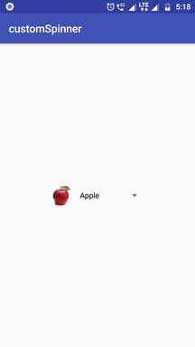
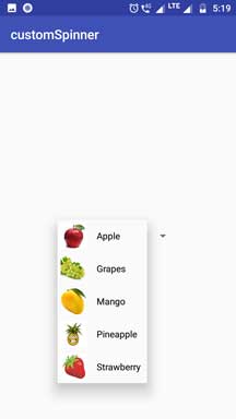
Look And Feel
Following images shows us how our spinner will look with images and texts.
Step 1. Custom Layout
In this step, we will create layout file that will represent the spinner’s view.
So, make a new layout resource file named spinner_custom_layout.xml
Add below source code in it
<?xml version="1.0" encoding="utf-8"?>
<LinearLayout xmlns:android="http://schemas.android.com/apk/res/android"
    android:layout_width="match_parent"
    android:layout_height="wrap_content"
     android:orientation="horizontal">

    <ImageView
        android:id="@+id/imageView"
        android:layout_width="50dp"
        android:layout_height="50dp"
        android:padding="5dp"
        android:src="@mipmap/ic_launcher" />

    <TextView
        android:id="@+id/textView"
        android:layout_width="fill_parent"
        android:layout_height="wrap_content"
        android:paddingLeft="10dp"
        android:paddingRight="10dp"
        android:layout_gravity="center"
        android:text="Custom Text"
        android:textColor="#000" />

</LinearLayout>
As you can see that the above layout file is purely custom and it does not include any default code or UI item.
You can set any UI widget like TextView, ImageView etc. as per your requirements.
Step 2. Add Fruit Images
Because we are making spinners with images, we need to add some images in the drawable folder.
Actually, you should add number of images which is equals to the number of items in the spinners.
Download the fruit images by clicking the below link
[sociallocker]Download Fruit Images[/sociallocker]
Now add these images into res-> drawable folder.
Step 3. Custom Adapter
We need to write custom adapter that will accept our custom layout file.
This adapter will create the custom view for our spinner using that spinner_custom_layout.xml file.
Following source code is for CustomAdapter.java file.
import android.content.Context;
import android.view.LayoutInflater;
import android.view.View;
import android.view.ViewGroup;
import android.widget.BaseAdapter;
import android.widget.ImageView;
import android.widget.TextView;

public class CustomAdapter extends BaseAdapter {
    Context context;
    int images[];
    String[] fruit;
    LayoutInflater inflter;

    public CustomAdapter(Context applicationContext, int[] flags, String[] fruit) {
        this.context = applicationContext;
        this.images = flags;
        this.fruit = fruit;
        inflter = (LayoutInflater.from(applicationContext));
    }

    @Override
    public int getCount() {
        return images.length;
    }

    @Override
    public Object getItem(int i) {
        return null;
    }

    @Override
    public long getItemId(int i) {
        return 0;
    }

    @Override
    public View getView(int i, View view, ViewGroup viewGroup) {
        view = inflter.inflate(R.layout.spinner_custom_layout, null);
        ImageView icon = (ImageView) view.findViewById(R.id.imageView);
        TextView names = (TextView) view.findViewById(R.id.textView);
        icon.setImageResource(images[i]);
        names.setText(fruit[i]);
        return view;
    }
}
Let us dive deep into this adapter class.
In the Main Activity of this example I have defined two arrays as below
String[] fruits={"Apple","Grapes","Mango","Pineapple","Strawberry"};
int images[] = {R.drawable.apple,R.drawable.grapes, R.drawable.mango, R.drawable.pineapple, R.drawable.strawberry };
First one is the string array which defines the names of the fruits.
Second contains the resource id of the drawable images.
In the constructor of the adapter, we will pass these two arrays as a parameter.
So we will receive them here at the execution of the adapter class.
getView() method from adapter is the most important part of this class. Below is the code for it.
@Override
    public View getView(int i, View view, ViewGroup viewGroup) {
        view = inflter.inflate(R.layout.spinner_custom_layout, null);
        ImageView icon = (ImageView) view.findViewById(R.id.imageView);
        TextView names = (TextView) view.findViewById(R.id.textView);
        icon.setImageResource(images[i]);
        names.setText(fruit[i]);
        return view;
    }
- getView() method will create a custom view for our spinner.
- It will inflate the spinner_custom_layout.xml file to create a particular view for the spinner.
After that, compiler will set the name and image of the fruit by using the string (fruit[i]) and integer (images[i]) array respectively.
Step 4. Last Writings
In this last step, you should update the code of your activity_main.xml and MainActivity.java file code
Replace the code of activity_main.xml with the below one
<?xml version="1.0" encoding="utf-8"?>
<LinearLayout xmlns:android="http://schemas.android.com/apk/res/android"
    xmlns:app="http://schemas.android.com/apk/res-auto"
    xmlns:tools="http://schemas.android.com/tools"
    android:layout_width="match_parent"
    android:layout_height="match_parent"
    android:gravity="center"
    tools:context=".MainActivity">

    <Spinner
        android:layout_width="wrap_content"
        android:layout_height="wrap_content"
        android:id="@+id/spinner"
    />

</LinearLayout>
I have taken one spinner in this file.
Copy following code into MainActivity.java file
import android.support.v7.app.AppCompatActivity;
import android.os.Bundle;
import android.view.View;
import android.widget.AdapterView;
import android.widget.Spinner;
import android.widget.Toast;

public class MainActivity extends AppCompatActivity {

    String[] fruits={"Apple","Grapes","Mango","Pineapple","Strawberry"};
    int images[] = {R.drawable.apple,R.drawable.grapes, R.drawable.mango, R.drawable.pineapple, R.drawable.strawberry };

    @Override
    protected void onCreate(Bundle savedInstanceState) {
        super.onCreate(savedInstanceState);
        setContentView(R.layout.activity_main);
        //Getting the instance of Spinner and applying OnItemSelectedListener on it
        Spinner spin = (Spinner) findViewById(R.id.spinner);
        spin.setOnItemSelectedListener(new AdapterView.OnItemSelectedListener() {
            @Override
            public void onItemSelected(AdapterView<?> parent, View view, int position, long id) {
                Toast.makeText(MainActivity.this, "You Select Position: "+position+" "+fruits[position], Toast.LENGTH_SHORT).show();
            }

            @Override
            public void onNothingSelected(AdapterView<?> parent) {

            }
        });

        CustomAdapter customAdapter=new CustomAdapter(getApplicationContext(),images,fruits);
        spin.setAdapter(customAdapter);
    }
}
Explanation of Above Code
Look at the below two lines
String[] fruits={"Apple","Grapes","Mango","Pineapple","Strawberry"};
int images[] = {R.drawable.apple,R.drawable.grapes, R.drawable.mango, R.drawable.pineapple, R.drawable.strawberry };
- First line defines the string array. This string array includes the names of the fruits.
- Second line defines the integer array which includes the resource id of the images which we have inserted in the drawable folder.
  CustomAdapter customAdapter=new CustomAdapter(getApplicationContext(),images,fruits);
  spin.setAdapter(customAdapter);
- Above code will first define the object of the adapter class and then compiler will set the adapter to the spinner.
- We have to pass out string and integer arrays as a parameter when defining the object of the adapter.
After this, our spinner will be populated with images and texts.
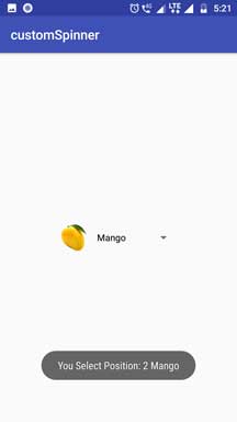
To track the on click method of the spinner, read below code
spin.setOnItemSelectedListener(new AdapterView.OnItemSelectedListener() {
            @Override
            public void onItemSelected(AdapterView<?> parent, View view, int position, long id) {
                Toast.makeText(MainActivity.this, "You Select Position: "+position+" "+fruits[position], Toast.LENGTH_SHORT).show();
            }

            @Override
            public void onNothingSelected(AdapterView<?> parent) {

            }
        });
- Here, I have set the code when the user will select any particular item from the spinner.
- A toast will be popped up when user selects the item.
This toast contains the position of the item in the spinner and also the name of the selected item.