Android Circular Progress Bar In Kotlin With Percentage is the topic of the day.
Android Circular Progress Bar In Kotlin example guides you make circular progress bar to show some loading process.
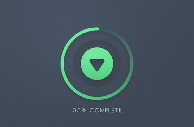
We will showcase the finished process in terms of percentage at the middle of the circle.
Also Read,
Take a look at the output first, and then we will develop the Android Circular Progress Bar In Kotlin.
Download Source Code for Android Circular Progress bar In Kotlin
[sociallocker]Download Kotlin Circular ProgressBar[/sociallocker]
Java Version
Android Circular Progress Bar example is also available in the Java version.
Visit it : Android Circular Progress Bar
Step 1. Create a new project in the Android Studio.
New Android Studio project with empty activity is required here.
Step 2. Creating drawable resource file
Create one drawable resource file named circular.xml (drawable resource file means in android studio project’s file structure, you will find a folder named drawable inside a res folder as shown in below image.)
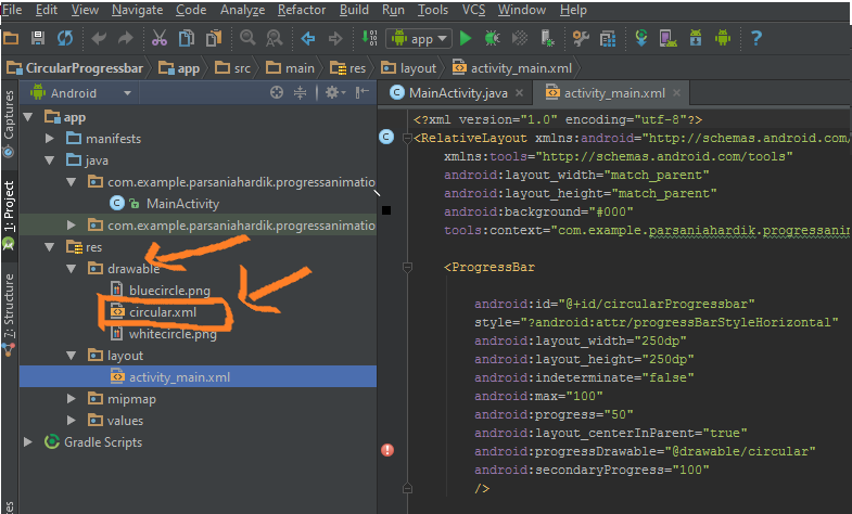
Put files in Drawable directory
Step 3. Coding circular.xml
Copy and paste following code into circular.xml
<?xml version="1.0" encoding="utf-8"?>

<layer-list xmlns:android="http://schemas.android.com/apk/res/android">
    <item android:id="@android:id/secondaryProgress">
        <shape
            android:innerRadiusRatio="6"
            android:shape="ring"
            android:thicknessRatio="20.0"
            android:useLevel="true">


            <gradient
                android:centerColor="#999999"
                android:endColor="#999999"
                android:startColor="#999999"
                android:type="sweep" />
        </shape>
    </item>

    <item android:id="@android:id/progress">
        <rotate
            android:fromDegrees="270"
            android:pivotX="50%"
            android:pivotY="50%"
            android:toDegrees="270">

            <shape
                android:innerRadiusRatio="6"
                android:shape="ring"
                android:thicknessRatio="20.0"
                android:useLevel="true">


                <rotate
                    android:fromDegrees="0"
                    android:pivotX="50%"
                    android:pivotY="50%"
                    android:toDegrees="360" />

                <gradient
                    android:centerColor="#00FF00"
                    android:endColor="#00FF00"
                    android:startColor="#00FF00"
                    android:type="sweep" />

            </shape>
        </rotate>
    </item>
</layer-list>
You can play around with different values for features like colors, radius, thickness etc. to customize the look and feel of circular progress bar.
Step 4. Updating activity_main.xml
Copy and paste following in activity_main.xml
<?xml version="1.0" encoding="utf-8"?>
<RelativeLayout xmlns:android="http://schemas.android.com/apk/res/android"
    xmlns:tools="http://schemas.android.com/tools"
    android:layout_width="match_parent"
    android:layout_height="match_parent"
    android:background="#000"
    tools:context="demonuts.kotlin_circular_progressbar.MainActivity">

    <ProgressBar

        android:id="@+id/circularProgressbar"
        style="?android:attr/progressBarStyleHorizontal"
        android:layout_width="250dp"
        android:layout_height="250dp"
        android:indeterminate="false"
        android:max="100"
        android:progress="50"
        android:layout_centerInParent="true"
        android:progressDrawable="@drawable/circular"
        android:secondaryProgress="100"
        />

    <ImageView
        android:layout_width="100dp"
        android:layout_height="100dp"
        android:background="@drawable/whitecircle"
        android:layout_centerInParent="true"/>

    <TextView
        android:id="@+id/tv"
        android:layout_width="250dp"
        android:layout_height="250dp"
        android:gravity="center"
        android:text="25%"
        android:layout_centerInParent="true"
        android:textColor="@color/colorPrimaryDark"
        android:textSize="20sp" />

</RelativeLayout>
In above code, we have used a white circular image which you can download here. Put this image in the drawable folder.
Step 5. Describing Handler
We will use Handler and Thread to accomplish our goal.
 Thread(Runnable {
            // TODO Auto-generated method stub
            while (pStatus < 100) {
                pStatus += 1

                handler.post {
                    // TODO Auto-generated method stub
                    mProgress.progress = pStatus
                    tv.text = pStatus.toString() + "%"
                }
                try {
                    // Sleep for 200 milliseconds.
                    // Just to display the progress slowly
                    Thread.sleep(16) //thread will take approx 3 seconds to finish
                } catch (e: InterruptedException) {
                    e.printStackTrace()
                }

            }
        }).start()
Above code will create a process for the specific amount of time.
You can change this time as per your requirements.
Step 6. Updating MainActivity.kt class
Final code for MainActivity.kt
import android.os.Handler
import android.support.v7.app.AppCompatActivity
import android.os.Bundle
import android.view.View
import android.view.animation.DecelerateInterpolator
import android.widget.ProgressBar
import android.widget.TextView

class MainActivity : AppCompatActivity() {

    internal var pStatus = 0
    private val handler = Handler()
    internal lateinit var tv: TextView
    override fun onCreate(savedInstanceState: Bundle?) {
        super.onCreate(savedInstanceState)
        setContentView(R.layout.activity_main)

        val res = resources
        val drawable = res.getDrawable(R.drawable.circular)
        val mProgress = findViewById<View>(R.id.circularProgressbar) as ProgressBar
        mProgress.progress = 0   // Main Progress
        mProgress.secondaryProgress = 100 // Secondary Progress
        mProgress.max = 100 // Maximum Progress
        mProgress.progressDrawable = drawable

        /*  ObjectAnimator animation = ObjectAnimator.ofInt(mProgress, "progress", 0, 100);
        animation.setDuration(50000);
        animation.setInterpolator(new DecelerateInterpolator());
        animation.start();*/

        tv = findViewById<View>(R.id.tv) as TextView
        Thread(Runnable {
            // TODO Auto-generated method stub
            while (pStatus < 100) {
                pStatus += 1

                handler.post {
                    // TODO Auto-generated method stub
                    mProgress.progress = pStatus
                    tv.text = pStatus.toString() + "%"
                }
                try {
                    // Sleep for 200 milliseconds.
                    // Just to display the progress slowly
                    Thread.sleep(16) //thread will take approx 3 seconds to finish
                } catch (e: InterruptedException) {
                    e.printStackTrace()
                }

            }
        }).start()
    }
}
That’s all for android circular progress bar in Kotlin.
Thank you for visiting and keep sharing resources of demonuts to other learners.
Cheers and happy coding!