
Kotlin Custom RatingBar Android Example is today’s tutorial.
We will learn to make Custom Star Image for rating bar. Also, you will be able to make custom star size and custom color for rating bar using kotlin.
By default there are star icons and some other general icon are there. But if you want full customized icon like hear shape or flags etc. then this tutorial will help you to achieve your goal.
First of all, see the following video for customized rating bar.
Step 1. New Project and Images
Make a new project with kotlin as the source language in android studio.
Also, do not forget to set empty activity as the default activity so that system do not add any unnecessary code in the new project.
As you have already seen in the output video, we are using heart shaped images instead of star to represent the ratings.
Black heart means no rating at all and number of red hearts means that much rating is there.
So, download both types of heart images first.
https://demonuts.com/wp-content/uploads/2018/07/hearts.zip
Now navigate to app->res-> drawable directory and add these heart images in this drawable folder.
Step 2. Writing XML File
Now in the app->res-> drawable directory, make a new XML file and give it a name like ratingbar_selector.xml
Below is the source code lines for ratingbar_selector.xml file.
<?xml version="1.0" encoding="utf-8"?>
<layer-list xmlns:android="http://schemas.android.com/apk/res/android" >

    <item
        android:id="@android:id/background"
        android:drawable="@drawable/heartback"/>
    <item
        android:id="@android:id/secondaryProgress"
        android:drawable="@drawable/heart"/>
    <item
        android:id="@android:id/progress"
        android:drawable="@drawable/heart"/>

</layer-list>
We are using both the types of heart images in the above code. This file will be used in the styles.xml file where we are adding some lines for making custom rating bar styles.
This file is telling the compiler to use black heart when rating bar is empty. When the user give 1 rate, first heart will be replaced by the red heart. Similarly, for 2,3,4 and 5 star ratings, compiler will replace black heart with the red one.
Step 3. Updating styles.xml File
Go to app->res-> values directory and open styles.xml file.
This file should have some pre written code. Instead of that, you need to write the below code in it
<resources>

    <!-- Base application theme. -->
    <style name="AppTheme" parent="Theme.AppCompat.Light.DarkActionBar">
        <!-- Customize your theme here. -->
        <item name="colorPrimary">@color/colorPrimary</item>
        <item name="colorPrimaryDark">@color/colorPrimaryDark</item>
        <item name="colorAccent">@color/colorAccent</item>
    </style>

    <style name="ImageRatingBar" parent="@android:style/Widget.RatingBar">
        <item name="android:progressDrawable">@drawable/ratingbar_selector</item>
        <item name="android:minHeight">50dp</item>
        <item name="android:maxHeight">50dp</item>
    </style>

</resources>
A style tab whose name is ImageRatingBar (<style name=”ImageRatingBar “>) is the main thing we are interested in.
First line in this style is giving the reference of the XML file that we have created in the previous step.
This drawable file (ratingbar_selector.xml) will control the look and feel of the rating bar when the user is sliding horizontally on the rating bar.
Then after, second line is setting the minimum height of the heart image. Similarly, third line is for the maximum height of the heart image. Generally, you should set these parameters as per the original size of the image. I have also did the same thing.
Step 4. Last and Main Tasks
There should be two main files in your project : activity_main.xml and MainActivity.kt
In your activity_main.xml file, write down the following lines
<?xml version="1.0" encoding="utf-8"?>
<LinearLayout xmlns:android="http://schemas.android.com/apk/res/android"
              xmlns:app="http://schemas.android.com/apk/res-auto"
              xmlns:tools="http://schemas.android.com/tools"
              android:layout_width="match_parent"
              android:layout_height="match_parent"
              android:orientation="vertical"
              tools:context=".MainActivity">

    <RatingBar
            android:layout_width="wrap_content"
            android:layout_height="wrap_content"
            style="@style/ImageRatingBar"
            android:id="@+id/rate"
            android:stepSize="1"
            android:numStars="5"
            android:layout_marginLeft="20dp"
            android:layout_marginTop="20dp"/>

    <TextView
            android:layout_width="wrap_content"
            android:layout_height="wrap_content"
            android:text="0"
            android:textSize="40dp"
            android:textColor="#000"
            android:layout_marginLeft="20dp"
            android:layout_marginTop="20dp"
            android:id="@+id/tv"/>

</LinearLayout>
One rating bar and one text view is there in the above code.
Now your MainActivity.kt file should contain the below source lines
import android.support.v7.app.AppCompatActivity
import android.os.Bundle
import android.util.Log
import android.widget.RatingBar
import android.widget.TextView

class MainActivity : AppCompatActivity() {

    private var ratingBar: RatingBar? = null
    private var tv: TextView? = null

    override fun onCreate(savedInstanceState: Bundle?) {
        super.onCreate(savedInstanceState)
        setContentView(R.layout.activity_main)

        ratingBar = findViewById(R.id.rate)
        tv = findViewById(R.id.tv)

        ratingBar!!.onRatingBarChangeListener =
            RatingBar.OnRatingBarChangeListener { ratingBar, rating, fromUser ->
                Log.d("uuu", ratingBar.rating.toString() + "")
                tv!!.text = ratingBar.rating.toString()
            }

    }
}
Here, compiler will first find the rating bar and text view using their IDs.
When the user change the rate, compiler will call onRatingBarChangeListener() method. It will simply change the rate value in the text view.
Some Problems with Solutions
Many time you want to change the size of the rating image as per the different screen sizes. This task is very complex.
Rating bar shows more than five stars sometimes and sometimes it shows less than five starts also. This thing depends on the size of the image and rating bar with each other. See the following
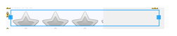 Many times, the stars of the rating bar are stretched vertically due to sizing problems as per following image.

For the perfect solution, sizes of star images and rating bar should be appropriate with each other.
For example, in our example, the size(height and width) of the rating bar is “wrap_content” and the size of heart image is 50 * 50 .
Actually, the perfect thing is that you set the height and width of the rating bar as the “wrap_content” and change the size of the images as per your requirements.
You can also create many images with various screen size according to mdpi, hdpi, xhdpi, xxhdpi, xxxhdpi as you have launcher icons in mipmap folder.
Download For Kotlin Custom Ratingbar Android
https://github.com/demonuts/Kotlin-Custom-RatingBar-Android-Example-Custom-Star-Image-Size