
We will boxing with android custom Ratingbar tutorial in this article.
In this post, we will learn how to give custom size, color, image, style to the in built rating bar.
By default, rating bar will show star image to give ratings to the user. We will change this star image with our own custom image.
Changes in the styles are also required for this example. You need to give your specific style to the rating bar.
I have used android studio to develop this android custom ratingbar tutorial.
Output
Below video demonstrate the final output of this example.
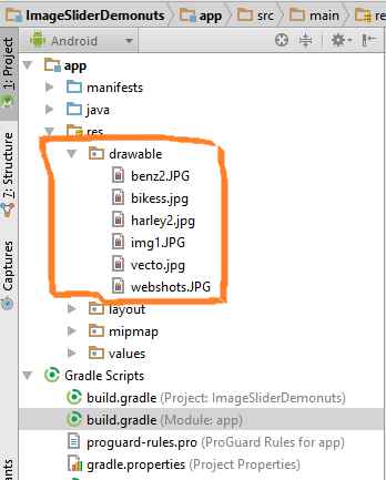
Step 1. Add Custom Images
Create one fresh new android studio project to reduce the complexity.
Now we need to add our custom images which we will use to show the rating stars.
As you have already shown in the output video, that we are going to use black and red heart icon instead of star.
Number of red hearts represents the actual value of rating.
So download heart images by clicking the below link.
[sociallocker]Download hearts Images[/sociallocker]
Now add images in res-> drawable directory.
Step 2. Making selector file
Now again in the drawable directory, create one xml file and give it a name “ratingbar_selector.xml”
Add following source code in it
<?xml version="1.0" encoding="utf-8"?>
<layer-list xmlns:android="http://schemas.android.com/apk/res/android" >

    <item
        android:id="@android:id/background"
        android:drawable="@drawable/heartback"/>
    <item
        android:id="@android:id/secondaryProgress"
        android:drawable="@drawable/heart"/>
    <item
        android:id="@android:id/progress"
        android:drawable="@drawable/heart"/>

</layer-list>
We have added our custom images in this file. We will use this file in the styles.xml file where we have done coding for adding custom styles.
Step 3. Changing styles.xml
Open up styles.xml file which is located at values->styles.xml
Copy below code in this file
<resources>

    <!-- Base application theme. -->
    <style name="AppTheme" parent="Theme.AppCompat.Light.DarkActionBar">
        <!-- Customize your theme here. -->
        <item name="colorPrimary">@color/colorPrimary</item>
        <item name="colorPrimaryDark">@color/colorPrimaryDark</item>
        <item name="colorAccent">@color/colorAccent</item>
    </style>

    <style name="ImageRatingBar" parent="@android:style/Widget.RatingBar">
        <item name="android:progressDrawable">@drawable/ratingbar_selector</item>
        <item name="android:minHeight">50dp</item>
        <item name="android:maxHeight">50dp</item>
    </style>

</resources>
Here, I have added a custom style named “ImageRatingBar”.
I have defined the minimum and maximum height of the image here which is the same as the original size of the image.
I have also set the progress drawable. Progress drawable will control the look and feel of the rating bar when the user is sliding horizontally on the rating bar.
An xml drawablw file named “ratingbar_selector.xml” is used as the progress drawable file.
Step 4. Main Activity Updation
Last thing is to update both files of Main Activity: activity_main.xml and MainActivity.java
Make your activity_main.xml file’s code look like the below
<?xml version="1.0" encoding="utf-8"?>
<LinearLayout xmlns:android="http://schemas.android.com/apk/res/android"
    xmlns:app="http://schemas.android.com/apk/res-auto"
    xmlns:tools="http://schemas.android.com/tools"
    android:layout_width="match_parent"
    android:layout_height="match_parent"
    android:orientation="vertical"
    tools:context=".MainActivity">

    <RatingBar
        android:layout_width="wrap_content"
        android:layout_height="wrap_content"
        style="@style/ImageRatingBar"
        android:id="@+id/rate"
        android:stepSize="1"
        android:numStars="5"
        android:layout_marginLeft="20dp"
        android:layout_marginTop="20dp"/>

    <TextView
        android:layout_width="wrap_content"
        android:layout_height="wrap_content"
        android:text="0"
        android:textSize="40dp"
        android:textColor="#000"
        android:layout_marginLeft="20dp"
        android:layout_marginTop="20dp"
        android:id="@+id/tv"/>

</LinearLayout>
Here, give your custom style to the rating bar.
Textview will show the current value of the rating bar.
Your source code for MainActivity.java is as following
import android.support.v7.app.AppCompatActivity;
import android.os.Bundle;
import android.util.Log;
import android.widget.RatingBar;
import android.widget.TextView;

public class MainActivity extends AppCompatActivity {

    private RatingBar ratingBar;
    private TextView tv;

    @Override
    protected void onCreate(Bundle savedInstanceState) {
        super.onCreate(savedInstanceState);
        setContentView(R.layout.activity_main);

        ratingBar = findViewById(R.id.rate);
        tv = findViewById(R.id.tv);

        ratingBar.setOnRatingBarChangeListener(new RatingBar.OnRatingBarChangeListener() {
            @Override
            public void onRatingChanged(RatingBar ratingBar, float rating, boolean fromUser) {
                Log.d("uuu",ratingBar.getRating()+"");
                tv.setText(String.valueOf(ratingBar.getRating()));
            }
        });

    }
}
Common Problems and It’s Solutions
Changing the size of rating images is very complex thing. There are many problems are there with it.
Sometimes rating bar shows more than five stars or sometimes it shows less than five stars. It all depends on the size of the image and also on the size of the rating bar. See the below image
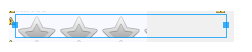
Many times, the stars of the rating bar are stretched vertically due to sizing problems as per following image.

Visit this for describing this problem but unique solution is described below.
Solution
Sizes of images and rating bar needs to be appropriate with respect to each other.
For example, in our example, the size of heart image is 50 * 50 and the size(height and width) of the rating bar is “wrap_content”.
Actually, the perfect scenario is that you keep the height and width of the rating bar as “wrap_content” always and change the size of the image as per your requirements.
You can also have multiple images with various size according to mdpi, hdpi, xhdpi, xxhdpi, xxxhdpi as you have launcher images in mipmap folder.
Download Source Code For Android Custom RatingBar
[sociallocker]Click To Download Custom RatingBar Source Code[/sociallocker]
Thank you very much for reading this tutorial.
Hope you have increased your knowledge after this example.
Share our resources with other learners and developers.